CARNIVORE - RETALIATION 12" Vinyl LP Album

- Roadrunner Records crossover thrash from 1987

Album Front Cover Photo of CARNIVORE - RETALIATION Visit: https://vinyl-records.nl/

Spinning Retaliation by Carnivore is a time machine to 1987, when hardcore crossover thrash metal was a street fight with riffs. This Roadrunner 12" LP (Cat# RR 9597, Made in Holland) got its tight, punchy snap from producer Alex Perialas, tracked at Systems Two, Brooklyn and Pyramid Sound, Ithaca. The record hits fast but stays heavy, from "Jack Daniel's And Pizza" into bruisers like "Ground Zero Brooklyn", "Inner Conflict", and "Technophobia". With Sean Taggart's cover art, a lyrics sleeve, and a chunky 230g total package, it's pure collector catnip.

Table of Contents

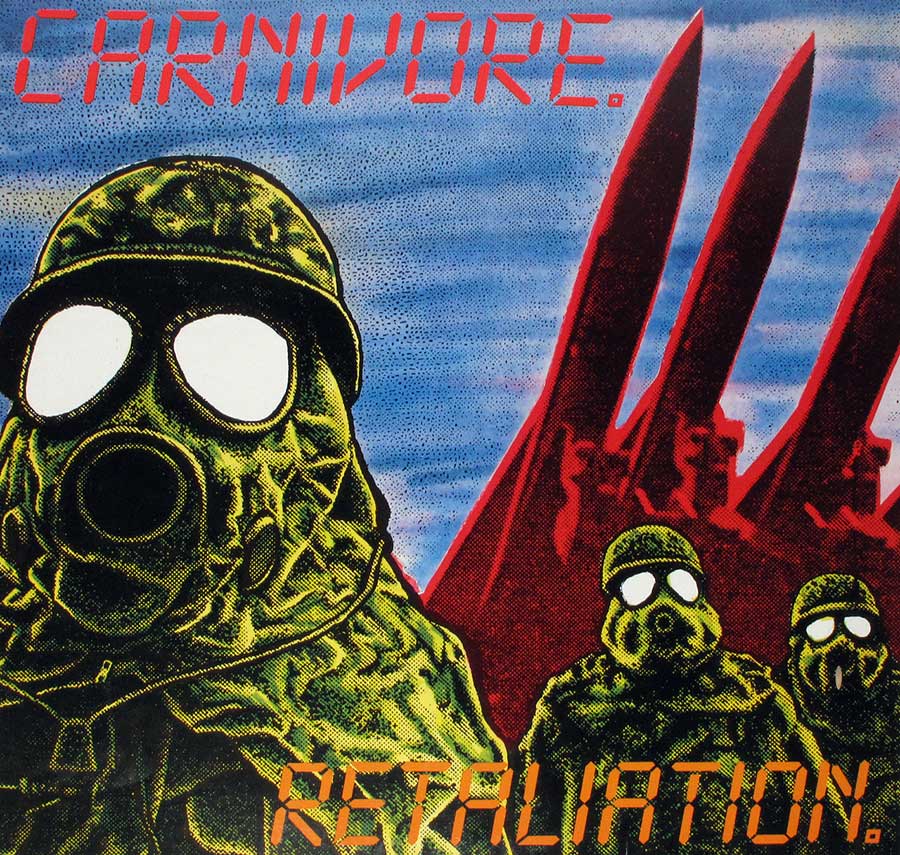
"CARNIVORE - Retaliation" (1987) Album Description:

Carnivore didn’t make polite records, and Retaliation is their final proof-of-life: a 1987 blast of hardcore crossover thrash that sounds like Brooklyn concrete learning how to sprint. It’s ugly, sharp, darkly funny, and way too honest for anyone hoping metal should behave. On Roadrunner, with Alex Perialas behind the boards, this one lands like a boot-print and then refuses to apologize.

1. Introduction on the band and the album

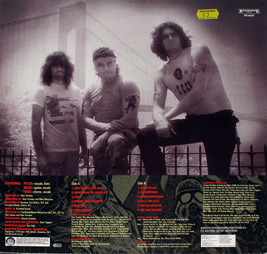
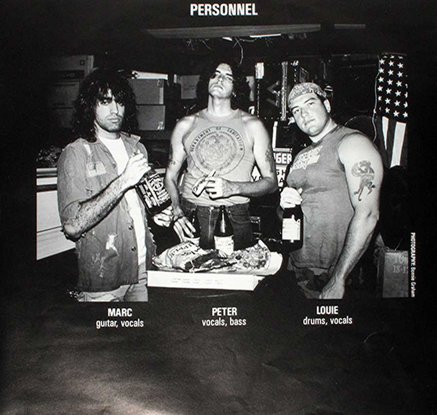
Retaliation is the second and final studio album by Carnivore, and it plays like a band sprinting toward the exit while throwing sparks at the walls. The lineup is lean and mean—Peter Steele steering the whole thing with bass, vocals, and that “I’m joking… unless?” glare. A lyrics sleeve came with this LP, which is basically Carnivore saying: “Yeah, read it. We meant it.”

2. Historical and cultural context

1987 was peak “everything louder, faster, sharper,” with thrash and hardcore cross-pollinating until the scene smelled like sweat and cheap beer instead of hairspray. In the U.S., crossover thrash was the bridge between pit-fighting hardcore and riff-nerd metal—shorter tempers, bigger guitars, fewer compromises. Retaliation sits right in that mid-’80s collision zone where sarcasm, anger, and speed all became a lifestyle choice.

3. How the band came to record this album

By the time Retaliation hit tape, Carnivore had already established their “no filters, no safety rails” identity, and this record feels like the moment they tightened the screws. Recording at Systems Two in Brooklyn and Pyramid Sound in Ithaca gave the album two matching energies: city grit and studio discipline. With Alex Perialas producing, the chaos still bites, but it bites in time.

4. The sound, songs, and musical direction

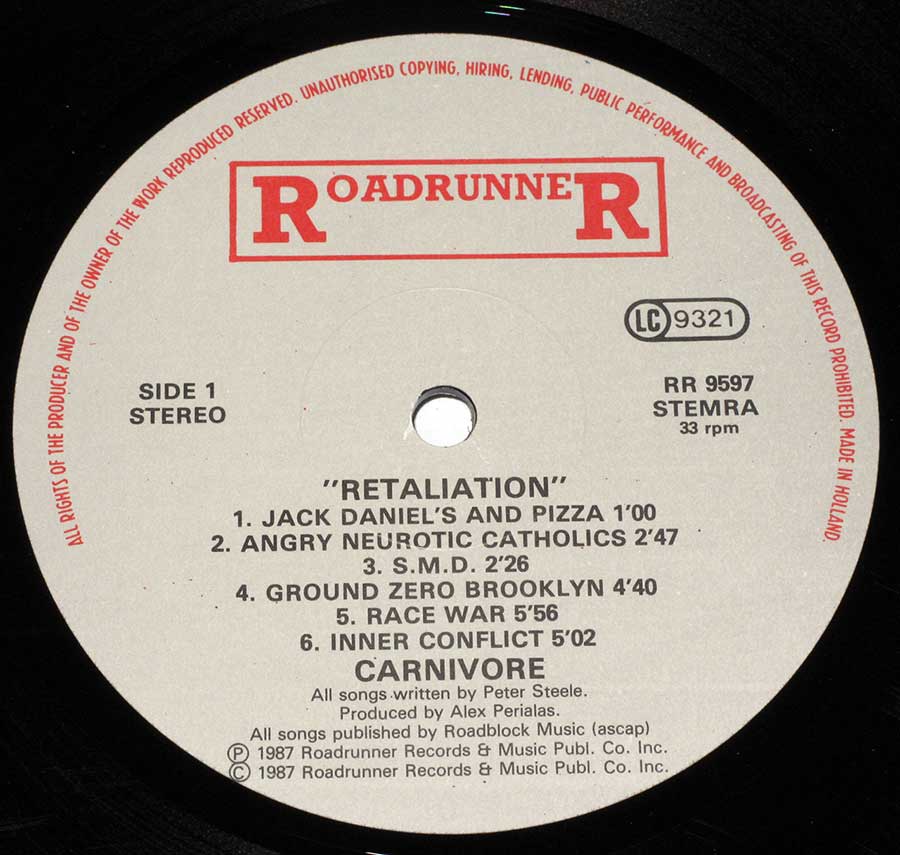
Sonically, this is crossover thrash with knuckles: fast riffs, blunt rhythms, and vocals that sound like they were carved out of a basement wall. The opener "Jack Daniel's And Pizza" is basically a cursed grin before the real violence starts—because Carnivore always liked jokes that draw blood. Tracks like "Ground Zero Brooklyn" and "Inner Conflict" carry that stomping, street-level menace, while "Technophobia" spits paranoia with a grin that’s a little too believable.

5. Comparison to other albums in the same genre/year

Put this next to the bigger 1987 names and you hear the difference instantly: where some bands aimed for arena-sized polish, Carnivore aimed for impact. That same year, thrash was flexing in multiple directions—technical, anthemic, theatrical—while crossover stayed proudly grimy and direct. Retaliation keeps the punk immediacy, but hits with metal weight, like it’s trying to start a riot using only downstrokes.

Quick 1987 neighborhood check:

  • AnthraxAmong the Living: bigger hooks, bigger crowds, mosh-friendly swagger.
  • TestamentThe Legacy: sharper precision, classic Bay Area thrash muscle.
  • D.R.I.Crossover / Suicidal TendenciesJoin the Army: the punk-metal handshake getting officially notarized.
6. Controversies or public reactions

Some albums cause debate because they change the sound; Retaliation causes debate because it doesn’t blink. Song titles like "Jesus Hitler" and "Race War" still trigger that instinctive double-take, and the lyrical posture is confrontational enough to make casual listeners bail immediately. Some people heard satire and provocation, others heard pure offense—and plenty of folks just turned it louder and pretended nuance wasn’t invited to the party.

7. Band dynamics and creative tensions

Knowing this is the band’s final studio statement, the album hits like a document of a group running hot and fast—no room for comfort, no patience for compromise. The writing feels locked to a single mission: say the ugly thing out loud, then make it riff. Whether that was unity or burnout, the end result is the same: a record that sounds like it had a deadline and a grudge.

8. Critical reception and legacy

Retaliation has never been “background music,” which is exactly why it stuck around: it’s a cult object for people who like their metal blunt and their humor black. Over time, it’s been treated less like a shock artifact and more like a snapshot of crossover thrash when it was still a street fight, not a genre tag. And if you trace Peter Steele forward, you can feel this record sitting in the shadows of what came next—same bite, different color palette.

9. Reflective closing paragraph

As a vinyl collector, Retaliation is one of those sleeves that feels heavier than the grams suggest—because the attitude inside it has gravity. Drop the needle and it still sounds like 1987 arguing with the world, one riff at a time, with zero interest in being liked. Decades later, the riffs still smell faintly of beer, sweat, and misplaced optimism.

Album Key Details: Genre, Label, Format & Release Info

Music Genre:

Hardcore Crossover Thrash Metal

Label & Catalognr:

Roadrunner – Cat#: RR 9597

Media Format:

Record Format: 12" LP Vinyl Stereo Gramophone Record
Total Weight: 230g

Year & Country:

1987 – Made in Holland

Production & Recording Information:

Producers:
  • Alex Perialas – Audio Engineer, Mixer, Record Producer

    In my book, his credit is the “this is gonna hit hard” stamp—Pyramid Sound vibes all day.

    Alex Perialas is an American audio engineer, mixer, and record producer who helped lock in the tight, punchy thrash sound of the mid-1980s through the early 1990s from Pyramid Sound Studios in Ithaca, New York—working with bands like Anthrax, Overkill, Testament, Nuclear Assault, S.O.D., and Flotsam & Jetsam. Later on, his work stretches into other lanes (Bad Religion, Pro-Pain), and he’s also been tied to teaching sound recording at Ithaca College—because apparently someone had to explain to the next generation how to make guitars sound like a chainsaw with manners.

Sound & Recording Engineers:
  • Mike Marciano – Sound Engineer

    The guy catching the punches on tape while the band swings for the lights.

    Mike Marciano, handled the hands-on engineering that helps Retaliation feel physical instead of polite—tightening the capture of the drums, keeping the guitars biting, and letting the low end hit like a subway door that doesn’t care about your feelings. Co-engineering this album with Alex Perialas is a big part of why the record lands so punchy: the performances stay raw, but the detail stays readable, even when the riffs start sprinting.

Recording Location:

Systems Two – Brooklyn, New York
Pyramid Sound Recording Studio – Ithaca, New York

  • Systems Two – Recording Studio (Brooklyn, New York)

    Brooklyn grit, live-room energy, and just enough control to keep the chaos aimed at the speakers.

    Systems Two, is where a chunk of Retaliation gets its street-level snap—tracking in Brooklyn puts the album’s attitude right up front, like the room itself is pushing the tempo. This studio setting helps preserve the crossover “pit first, questions later” feel, while still keeping the takes clean enough for Perialas and Marciano to carve out that tight, percussive bite the record lives on.

  • Pyramid Sound Recording Studios – Recording Studio (Ithaca, New York)

    Downtown Ithaca’s secret weapon: the room where a ton of ’80s riffs learned discipline and learned to punch.

    Pyramid Sound Recording Studios is a long-running Ithaca, New York recording spot launched by Alex Perialas (the guy with the “your snare will be heard” philosophy). From the mid-1980s into the early 1990s, it became a thrash-metal magnet—bands like Anthrax, Overkill, Testament, Nuclear Assault, and S.O.D. rolled through to capture that tight, aggressive East Coast bite. It didn’t stay boxed into metal either: later decades saw punk/hardcore and other genres pass through the same rooms, because good engineering doesn’t care what jacket you’re wearing. The studio’s downtown location (105 E. Clinton Street) has even had its share of real-world drama tied to nearby construction over the years—because of course the universe can’t just let a legendary studio exist in peace.

Mastering Engineer & Location:
  • Tom Coyne – Mastering Engineer
    Listed as (1954–2017) in the credits provided.

    The final polish that keeps the volume brutal without turning it into pure mush.

    Tom Coyne, gave Retaliation its last shot of discipline—balancing the bite, weight, and speed so the record hits hard across a full side of vinyl without collapsing into harshness. Mastering on an album like this isn’t “make it pretty,” it’s “make it survive”: the low end stays dangerous, the guitars stay sharp, and the drums keep their punch when the tempo and attitude both refuse to sit down.

Album Cover Design & Artwork:
  • Sean Taggart – Cover Art

    The cover that sets the mood before the needle even drops: bleak, loud, and not here to be liked.

    Sean Taggart, delivers the visual handshake for Retaliation—the artwork frames the album as confrontational crossover, not party metal, and it matches the music’s “straight face / dark joke” energy. Good cover art on a record like this is part of the impact: it primes the listener for aggression, grit, and that slightly unhinged New York edge before the first riff even gets a chance to swing.

Photography:
  • Bonnie Graham – Photography

    The camera work that makes the band look like they just walked out of the same alley the riffs came from.

    Bonnie Graham, is credited with photography that supports Retaliation as a complete object, not just a stack of tracks—images that carry the record’s tough, lived-in vibe and help sell the “this is real” attitude crossover thrives on. That visual grit matters on vinyl, where the sleeve is part of the ritual: pull it out, stare it down, then drop the needle like it’s a dare.

  • Richard Termini – Photography
    Also credited for keyboards and producer in the provided notes, but only “Photography” fits cleanly in this slot.

    The lens that captures the band’s personality—equal parts menace and “yeah, we meant that.”

    Richard Termini, adds photography that helps define the era around Retaliation—the kind of shots that don’t glam things up, but document the band as it actually felt in the room. With the additional credit notes pointing to keyboards and producer involvement, the contribution reads like more than just “someone brought a camera”: it suggests a closer creative orbit around the album’s presentation and atmosphere, even if the sleeve only spells out “Photography.”

Band Members / Musicians:

Band Line-up:
  • Peter (Peter Steele) – Vocals, Bass

    The record’s gravitational pull: a bass tone that bites, plus vocals that sound like a warning label.

    Peter (Peter Steele), drives Retaliation with that signature “big man, bigger mood” delivery—lead vocals that swing between barked aggression and deadpan menace, and bass lines that don’t just support the riffs, they bully them into shape. The album’s weight lives in his low end: thick, forward, and relentless, turning fast crossover parts into something that still feels heavy. Even when the songs sprint, the tone stays massive, giving this record its grim, street-level authority.

  • Mark (Marc Piovanetti) – Guitar, Vocals

    The riff-slinger who sharpens the crossover edge and keeps the momentum mean, tight, and nasty.

    Mark (Marc Piovanetti), brings the guitar attack that makes Retaliation feel like a proper crossover record instead of “thrash with a bad attitude.” The riffing is fast, percussive, and built for impact—more shove than shimmer—locking into the drums so the songs hit like short bursts of controlled violence. Backing vocals add that gang-shout bite where it counts, helping the choruses feel like they were designed to be yelled back from the pit, not politely admired from the couch.

Band Line-up:
  • Louie (Louie Beateaux) – Drums

    The engine room: tight, fast, and stubbornly on-the-rails even when the riffs try to start a bar fight.

    Louie (Louie Beateaux), anchors Retaliation with drumming that’s built for speed but never turns sloppy—hardcore urgency with metal-level punch. The cymbal work and snare cracks keep the album’s forward motion aggressive, while the kick patterns help the riffs feel heavier than their runtimes suggest. This is the kind of playing that makes the whole record feel like it’s leaning into the next song before the previous one has finished bleeding out.

Complete Track-listing:

Tracklisting Tracks 1–6:
  1. Jack Daniel's And Pizza (0:55)
  2. Angry Neurotic Catholics (2:48)
  3. S.M.D. (2:27)
  4. Ground Zero Brooklyn (4:40)
  5. Race War (5:56)
  6. Inner Conflict (5:03)
Video: Carnivore - S.M.D.
Tracklisting Tracks 7–12:
  1. Jesus Hitler (5:17)
  2. Technophobia (3:56)
  3. Manic Depression (3:07)
  4. USA For USA (3:21)
  5. Five Billion Dead (3:02)
  6. Sex And Violence (3:51)
Video: Carnivore - Sex And Violence

Disclaimer: Track durations shown are approximate and may vary slightly between different country editions or reissues. Variations can result from alternate masterings, pressing plant differences, or regional production adjustments.

Album Front Cover Photo
Front cover of Carnivore Retaliation LP showing three soldiers in green camouflage gas masks with blank white eye lenses, set against a blue sky and red missile-like structures, with the band name Carnivore in red segmented lettering at the top and the album title Retaliation at the bottom. The stark military imagery, aggressive color contrast, and digital-style typography emphasize the album’s confrontational crossover thrash identity and make this Roadrunner sleeve instantly recognizable to collectors.

This is the front cover of “Retaliation” by Carnivore, and it hits visually as hard as the record does sonically. The image shows three human figures dressed in military-style green camouflage suits, each wearing a full gas mask with large, circular, opaque white eye lenses. The masks erase all facial identity, turning the figures into anonymous symbols rather than individuals, which immediately sets a hostile, confrontational tone.

The largest figure dominates the left foreground, cropped at the chest, pulling focus through sheer scale. Two smaller figures stand behind to the right, slightly recessed, creating depth and a sense of formation rather than chaos. All three figures face forward, confronting the viewer directly, which is a deliberate design choice that makes the sleeve feel aggressive and uninviting—in a way that perfectly fits crossover thrash aesthetics of the late 1980s.

The background is split sharply by color and texture. A pale, slightly clouded blue sky fills most of the upper area, while three tall, red, missile-like or industrial spike shapes rise behind the figures on the right. These red forms are abstract but unmistakably suggest weapons or large-scale destruction, reinforcing themes of conflict, paranoia, and societal breakdown without spelling anything out literally.

Typography is bold and intentionally crude. The band name CARNIVORE appears at the top in red, using a segmented, digital-style font that looks almost like LED numerals or broken machinery readouts. The album title RETALIATION is placed at the bottom in the same red segmented font, visually bracketing the image and locking the design together. The red lettering clashes sharply against the blue sky, ensuring instant legibility even from across a room or record bin.

From a collector’s perspective, this sleeve is a textbook example of late-’80s Roadrunner visual identity: high-contrast colors, confrontational imagery, and zero attempt at subtlety. The artwork is printed edge-to-edge with no decorative borders, maximizing impact. On an original vinyl pressing, this cover is meant to be seen large, flat, and loud—exactly how crossover thrash albums were designed to announce themselves in a crowded rack.

Album Back Cover Photo
Back cover of Carnivore Retaliation LP showing the three band members posed outdoors near a bridge, dressed in casual street clothing, photographed in gritty black-and-white tones. The layout includes full track listings for both sides, musician credits, production details, label logos, and a small gas-mask graphic, presenting the album as a raw, street-level crossover thrash release with strong New York identity.

This image shows the back cover of “Retaliation” by Carnivore, and it shifts the album’s message from abstract aggression to direct, human presence. The upper half is dominated by a gritty, monochrome band photograph taken outdoors, with a large suspension bridge visible in the background. The bridge structure, partially faded into haze, immediately anchors the image in an urban New York setting and reinforces the album’s street-level credibility.

Three band members are positioned along a metal railing, facing the camera with a confrontational, no-nonsense stance. Clothing is casual and functional—T-shirts, sleeveless tops, jeans—no theatrical costumes, no glam polish. One member wears a sleeveless shirt that exposes muscular arms and tattoos, another appears with longer hair and a relaxed posture, and the third stands slightly apart, giving the photo a balanced but tense composition. The image feels deliberately unrefined, as if documentation mattered more than presentation.

Below the photograph, the layout becomes dense and information-heavy, exactly what vinyl collectors expect. The track listings for Side A and Side B are printed in tight columns, clearly separated and easy to scan when holding the sleeve in hand. Song titles are listed without decoration, reinforcing the blunt attitude of the music. This section also includes detailed musician credits, production roles, recording studios, and mastering information, all tightly packed to maximize use of space.

The color palette is restrained: dark, muted tones dominate, with selective use of red text for emphasis. That red ties visually back to the front cover typography, creating continuity across the sleeve. A small gas mask graphic appears in the lower right area, echoing the front cover artwork and acting as a visual signature rather than a focal point.

Label branding is clearly visible, including the Roadrunner Records logo and catalog number, placed where collectors instinctively look. From a vinyl perspective, this back cover is all about function and attitude: clear credits, readable track lists, strong band identity, and zero wasted space. It presents Retaliation not as a concept piece, but as a physical document of a band, a place, and a moment in late-1980s crossover thrash.

First Photo of Custom Inner Sleeve
Original custom inner sleeve of Carnivore Retaliation LP featuring a gritty black-and-white band photograph set against an urban bridge backdrop, combined with dense lyric blocks, track listings, credits, and small graphic elements. The raw photography, compact typography, and information-heavy layout emphasize the album’s New York crossover thrash identity and the inner sleeve’s role as both visual statement and functional lyric insert for vinyl collectors.

This image shows the original custom inner sleeve of “Retaliation” by Carnivore, and it is where the album turns fully practical and confrontational at the same time. The sleeve combines photography, lyrics, credits, and graphic elements into a single, dense layout designed to be read while the record spins. Everything here serves function first, attitude second, and decoration last.

The dominant visual element is a grainy, high-contrast black-and-white photograph of the band, positioned outdoors in front of a large suspension bridge. The bridge structure rises behind them, slightly blurred and foggy, reinforcing a strong New York atmosphere without explicitly naming the location. The band members stand or lean casually against a metal railing, wearing everyday clothing rather than stage outfits, which grounds the image firmly in street-level reality.

Below and around the photograph, the inner sleeve becomes text-heavy. Lyrics are printed in compact blocks, tightly spaced to conserve space, with minimal margins. Track listings are clearly separated by side, making it easy to follow along while listening. Credits for musicians, production, recording studios, and mastering are grouped logically, rewarding close inspection rather than casual glancing.

Typography is utilitarian and direct. Fonts are clean and readable, with selective use of red text to highlight song titles or section headers. That red accent visually connects the inner sleeve to the front and back cover design, maintaining a consistent visual language across the entire package. A small gas mask graphic appears again, acting as a recurring motif rather than a centerpiece.

From a vinyl collector’s perspective, this inner sleeve matters because it is an original printed OIS, not a generic replacement. It adds physical and archival value, documents the full lyrical content, and completes the visual narrative of the album. Handling this sleeve feels intentional: pull it out, read it, absorb it, then slide it back carefully before dropping the needle again.

Close up of Side One record's label
Close-up of the Side One record label from Carnivore Retaliation LP on Roadrunner Records, showing a light gray label with red Roadrunner logo, catalog number RR 9597, LC code 9321, stereo 33 rpm marking, full Side 1 track listing with durations, songwriter credit to Peter Steele, producer credit to Alex Perialas, and Made in Holland manufacturing text around the rim.

This image is a close-up of the Side One vinyl label from “Retaliation” by Carnivore, and it delivers exactly the kind of hard data vinyl collectors look for first. The label background is a flat, light gray tone, clean and uncluttered, allowing the red and black print to stand out with maximum contrast and legibility.

At the top sits the classic Roadrunner Records logo, printed in red inside a rectangular frame, immediately confirming label identity without ambiguity. To the right of center, the LC 9321 rights society code is clearly printed, a detail crucial for European pressings. Below it appears the catalog number RR 9597, paired with STERRA and 33 rpm, locking this firmly into the Dutch manufacturing run.

The left side of the label specifies SIDE 1 and STEREO, followed by the album title “RETALIATION” in quotation marks. Beneath that, the full Side One track listing is printed in a neat vertical column, including exact running times for each track. This confirms six tracks on Side One, starting with “Jack Daniel’s And Pizza” and ending with “Inner Conflict”, with no deviations or alternate mixes indicated.

Lower on the label, credits are presented plainly and without decoration: all songs written by Peter Steele and produced by Alex Perialas. Publishing information lists Roadblock Music (ASCAP), followed by the 1987 copyright lines for Roadrunner Records & Music Publishing Co. Inc. The outer rim text circles the label edge, stating reproduction and broadcasting restrictions and confirming Made in Holland.

From a collector’s standpoint, this label ticks every verification box: correct logo style, clean typography, precise timings, and unmistakable country-of-origin markings. It confirms an original European pressing and provides the kind of manufacturing detail that separates a documented archive copy from a guesswork placeholder.

All images on this site are photographed directly from the original vinyl LP covers and record labels in my collection. Earlier blank sleeves were not archived due to past storage limits, and Side Two labels are often omitted when they contain no collector-relevant details. Photo quality varies because the images were taken over several decades with different cameras. You may use these images for personal or non-commercial purposes if you include a link to this site; commercial use requires my permission. Text on covers and labels has been transcribed using a free online OCR service.