-
Wake of the Flood is a classic Grateful Dead album that showcases the band's musical evolution and their ability to write and perform songs that are both meaningful and enjoyable. This web page has photos of album covers, inner sleeves, record labels together with production details, musicians and track-listing.
"Wake of the Flood" is the Grateful Dead at a very specific moment: still psychedelic, more grown-up, and quietly confident enough to let the songs breathe instead of sprinting to the next cosmic explosion.
I always think of this record as a bridge between the Dead everyone mythologizes and the Dead who just got on with the work, sleeves rolled up, eyes forward, and a little more jazz in the bloodstream.
Even the catalog stamp GD-01 feels like a declaration: this is their world, their pace, their rules, and you can either float with it or go back to three-minute singles and pretend you are fine.
By 1973 in the USA, the wide-eyed 1960s glow had faded into something more complicated, and rock felt like it was learning how to be adult without becoming boring.
This is the era where listeners had the patience for longer stories, deeper grooves, and songs that did not explain themselves on the first spin, which is basically the Grateful Dead saying, "Finally. Welcome."
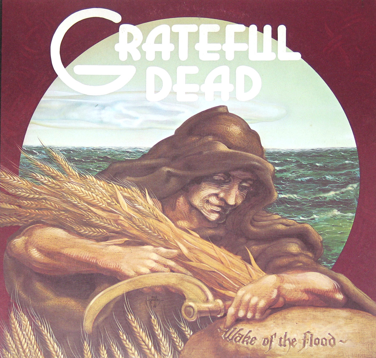
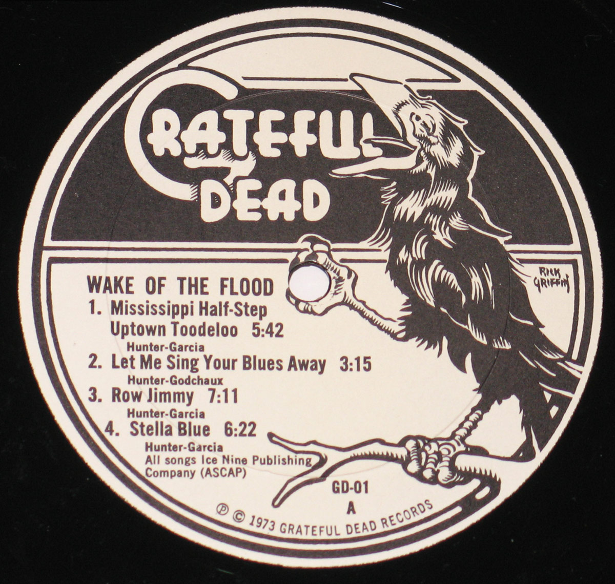
The page points right at the heart of it: Grateful Dead Records, GD-01, and a record that reads like independence made audible.
And the setting matters too: the tracks here are tied to the Record Plant in Sausalito, California, which fits the vibe perfectly because this album sounds like coastline weather and late-night headlights, not a sterile studio cube.
Genre-wise it sits in Psych and Acid Rock, but in the early-70s sense: less lava lamp chaos, more steady heartbeat, more space between the notes, more trust that the band will land the plane.
"Mississippi Half-Step Uptown Toodeloo" opens the door with a grin and a little swagger, then the album immediately shows its range by sliding into the loose, lived-in feel of "Row Jimmy."
"Stella Blue" is the slow-burn gut punch, the kind of song that makes a room go quiet even if nobody admits it.
"Eyes of the World" feels like sunlight filtered through moving leaves, and when it hits, it hits like a gentle insistence: keep going, keep looking, stay human.
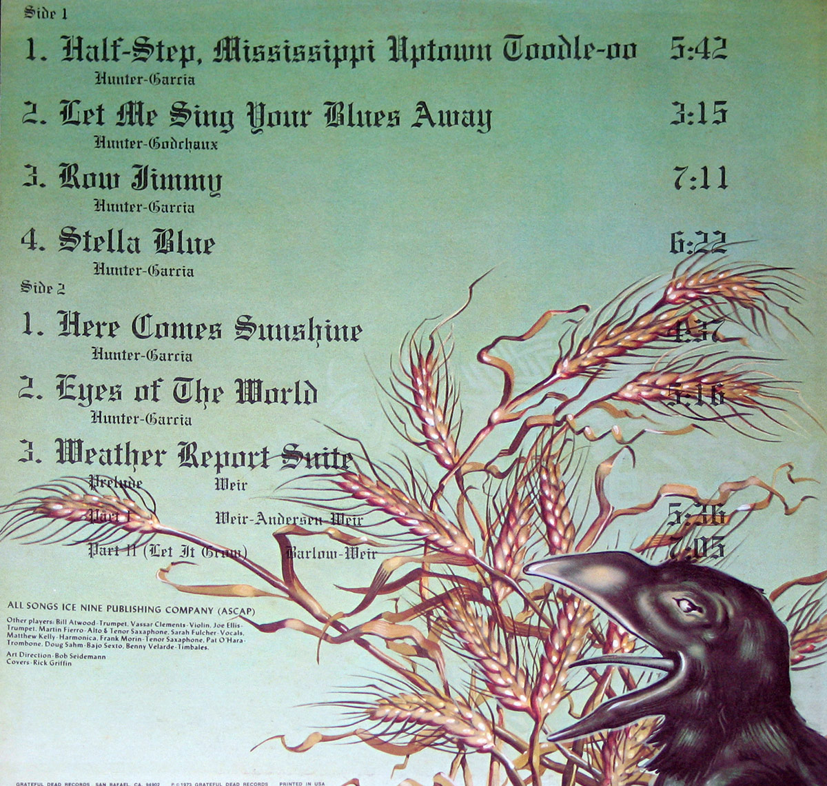
Then you get the big architectural piece, "Weather Report Suite," with its parts ("Prelude," "Part I," and "Part II (Let It Grow)") moving like changing skies, not like a band showing off for points.
In the early-70s psychedelic orbit, some bands chased louder distortion and heavier drama, but this album chooses clarity and flow, which is a bold move when everyone else is trying to win the volume war.
Within the Dead universe, it feels more expansive and patient than their earlier, more roots-leaning classics, like they are letting the music stretch out and become its own weather system.
This page does not hang any big scandal on the album, and honestly the "controversy" here is subtler: a band shifting gears while the audience tries to keep up.
Some people always want their favorite band frozen in amber, but the Dead never really agreed to that contract, and "Wake of the Flood" is proof.
The lineup here is a small universe: Jerry Garcia and Bob Weir sharing the front edge, Keith Godchaux and Donna Jean Godchaux adding color and lift, and Phil Lesh and Bill Kreutzmann keeping the whole thing moving like a living machine.
Then the guests show up like unexpected characters in a road movie: violin, harmonica, horns, saxophones, even bajo sexto and timbales, which tells me the band was not interested in staying inside neat genre fences.
What lasts is the album's sense of balance: exploratory without being messy, warm without being soft, and confident without sounding like it is begging for applause.
It also plants a flag for what the Grateful Dead would keep proving for decades: the songs are not museum pieces, they are frameworks for feeling, and they age the way good paper and good stories do.
When I pull this sleeve out, I do not expect fireworks; I expect atmosphere, craft, and that strange Dead magic where the music feels like a place you can return to.
Decades later, "Wake of the Flood" still smells faintly of sea air, old cardboard, and the kind of stubborn optimism you only get from a band brave enough to keep evolving.
Music Genre: Psych, Acid Rock Music |
Album Production Information: Art Direction: Bob Seidemann Album Cover Design Rick Griffin |
Record Label & Catalognr: Grateful Dead Records GD-01 |
Media Format: 12" Vinyl LP Gramophone Record |
Year & Country: Release Year: 1973Release Country: Made in USA |
Band Members and Musicians on: Grateful Dead Wake of the Flood |
|
Complete Track Listing of: Grateful Dead Wake of the Flood |
|
The album cover of Wake of the Flood by the Grateful Dead is an evocative, richly textured painting that captures both the essence of change and a deep, earthy mysticism. Dominating the scene is a hooded, cloaked grain reaper—aged, almost skeletal, yet powerful—cradling a bundle of golden wheat in one weathered arm. The face, lined with years of wisdom and toil, bears a cryptic, knowing smile, as if in silent conversation with time itself.
The grain reaper’s other hand rests upon a stone slab, the album’s title, Wake of the Flood, meticulously carved into its surface in an archaic, flowing script. Just below, a sharp sickle gleams, its handle worn with use, nestled against the cascading wheat, a stark reminder of both harvest and inevitability.
Behind the grain reaper, the landscape is split between two powerful elements—land and sea. A turbulent ocean churns in deep greens and blues, waves rolling towards the shore under a sky heavy with overcast clouds. The distant horizon hints at a break in the storm, a sliver of light barely peeking through, symbolizing both destruction and renewal.
The border framing the image is a deep, moody red, lending warmth and weight to the composition, reinforcing the album’s introspective, transitional themes. This is an album cover steeped in metaphor—life, death, and rebirth rendered in stunning, almost mythological detail, a perfect visual gateway into the sonic journey within.
The back cover of Wake of the Flood is a striking and surreal fusion of nature and typography, blending rustic elegance with an eerie sense of decay and renewal. The background is a muted, pale green sky that feels both soft and desolate, creating a dreamlike atmosphere.
Dominating the lower right is a black raven, its beak wide open in mid-call, with glossy feathers that appear almost sculpted, reflecting a dark energy. The bird’s sharp, curved beak and expressive eye suggest both wisdom and a sense of foreboding, a harbinger of change against the backdrop of an album steeped in transition.
The lower half of the image is filled with gnarled, twisting wheat stalks, their golden heads bending and curling in a chaotic, almost flame-like motion. The wheat, rendered in deep oranges and earthy browns, contrasts starkly with the smooth, pale sky, creating a sense of movement and tension. Some stalks appear vibrant, while others seem withered and brittle, reinforcing themes of time, growth, and inevitable decay.
Above this scene, the album’s tracklist is elegantly scripted in an old-world, calligraphic font, seamlessly blending with the organic curves of the wheat. The song titles stretch across the top in deep black ink, their intricate lettering lending an almost biblical weight to the composition. Each title stands strong against the soft background, as though etched into the air itself.
The overall effect of the cover is one of mysticism and transformation—an image that echoes the album’s themes of renewal, loss, and evolution. The art, evocatively illustrated by Rick Griffin, captures a delicate balance between beauty and eeriness, a haunting visual metaphor for the music within.
"Wake Of The Flood" Record Label Details: Grateful Dead Records GD-01 © ℗ 1973 Grateful Dead Records Sound Copyright
The record label for Wake of the Flood is a stunning black-and-white illustration, designed by Rick Griffin, with a bold, high-contrast aesthetic that immediately draws the eye. The outer edge of the label is encased in a thick circular border, reinforcing the structured yet organic design of the artwork.
Dominating the right half of the label is a meticulously detailed raven, its feathers etched with fine lines, evoking both elegance and an eerie presence. The bird's beak is wide open, mid-call, as if announcing the music itself. Its sharp talons grip a twisted branch that extends toward the lower edge of the label, adding a sense of movement and intensity. The raven’s eye appears almost knowing, as if it holds the secrets of the album’s deeply reflective themes.
At the top, "Grateful Dead" is emblazoned in a stylized, slightly warped font that seems to drip like liquid, giving it a psychedelic yet grounded feel. The typography, reminiscent of the band's earlier era of counterculture aesthetics, perfectly complements the visual storytelling of the raven.
Below this, the album title, Wake of the Flood, is displayed in a clean, bold typeface, followed by the track listing for Side A. The song titles and respective durations are arranged neatly, with writing credits listed beneath each title. The label also bears the identifier "GD-01," denoting its original release under the newly formed Grateful Dead Records label.
At the very bottom, the fine print credits all songs to Ice Nine Publishing (ASCAP) and confirms the copyright © ℗ 1973 Grateful Dead Records. This label design encapsulates the essence of the album: an evocative blend of mysticism, nature, and the band's signature artistry, making it an unforgettable piece of Grateful Dead iconography.
Recorded between August and September 1970, "American Beauty" showcased a collaborative effort between the band's songwriting talents. While Jerry Garcia and Robert Hunter are credited on most of the tracks
- American Beauty (German Release) - American Beauty (USA Release)
The name "Aoxomoxoa" is derived from a word play created by the Grateful Dead's lyricist, Robert Hunter. It does not have a specific meaning but was intended to be a whimsical and cryptic word.
Aoxomoxoa 12" Vinyl LP
Dark Star (Glastonbury Fayre): The centerpiece here is the legendary "Dark Star," a song notorious for its improvisational jams. However, there's a snag. The Grateful Dead never played Glastonbury Fayre in 1971
Dark Star / Dont Ease Me In 12" Vinyl Maxi
This 2LP vinyl release isn't your typical studio album. It's a portal to the heart of the Grateful Dead's live experience. Recorded throughout 1971, it captures the band at a peak.
Self-Titled aka Skull and Roses 12" Vinyl 2LP
While not officially sanctioned by the Grateful Dead themselves, "Vintage Dead" holds a special place in their history. Recorded without the band's involvement, it falls under the category of a legal release rather than a bootleg.
Vintage Dead 12" Vinyl LP
Through their relentless touring and experimentation, the band cultivated a dedicated fan base known as the "Deadheads". "Wake of the Flood" was their first album on their independent label, Grateful Dead Records
Wake of the Flood 12" Vinyl LP
While "The Grateful Dead" doesn't feature any of the band's signature long-form jams that would define their later career, it lays the groundwork for their improvisational exploration.
The Grateful Dead 12" Vinyl LP
Workingman's Dead marked a shift for the Dead. It moved away from the heavier psychedelia of their earlier work towards a more rootsy sound, featuring songs like "Uncle John's Band" and "High Time" that have become fan favorites.
Workingman's Dead 12" Vinyl LP