POISON - Open Up And Say Ah (Censored Cover) 12" Vinyl LP Album

- Banned album artwork, late-’80s glam metal excess, and a cover that made retailers nervous

Album Front Cover Photo of POISON - Open Up And Say Ah (Censored Cover) Visit: https://vinyl-records.nl/

The original album cover was banned somehow because some retailers objected to this sleeve on the grounds that it was too "raunchy". "Open Up and Say... Ahh!" is the second studio album by American glam metal band Poison, released in 1988 through the Enigma label. The album is widely considered a classic in the glam metal genre.

Table of Contents

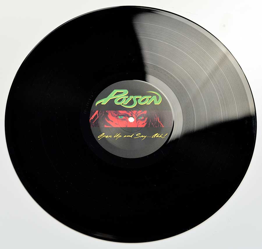
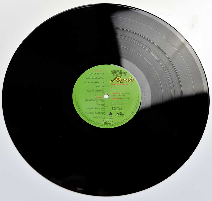
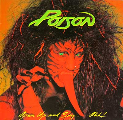
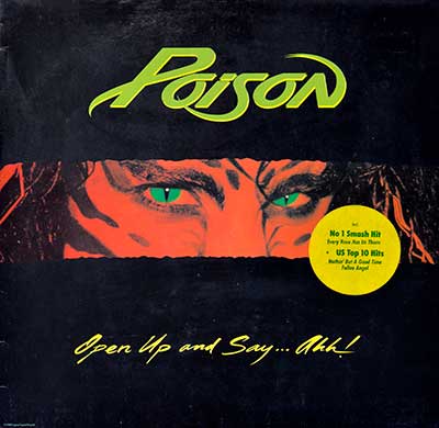
"Open Up and Say... Ahh!" (1988) Album Description:

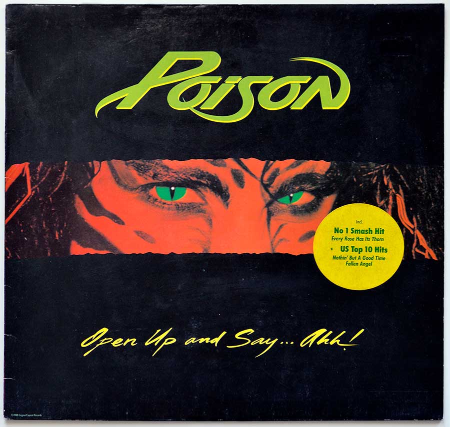
Poison didn’t just follow up their debut here—they cannonballed into the late-’80s mainstream with "Open Up and Say... Ahh!", a record built for loud rooms, loud hair, and louder sing-alongs. This specific Holland / Germany pressing adds its own collector twist with the infamous censored cover, like someone tried to PG-rate a party by throwing a black curtain over it. Either way, the grooves still grin back at you.

Introduction

"Open Up and Say... Ahh!" is Poison at the exact moment they realized hooks could hit as hard as riffs—and then they doubled down. It’s the kind of album that doesn’t ask permission; it kicks the door in, hands you a chorus, and dares you not to shout it back. Decades later, it still plays like a time capsule full of neon, denim, and extremely questionable confidence.

Historical and cultural context

In 1988, hard rock and glam metal were basically running a full-time job on radio and MTV, with big choruses competing for oxygen and ballads sneaking into the charts like guilty pleasures. The scene was shiny, loud, and a little ridiculous—exactly the point—and bands were expected to deliver “hits,” not just attitude. Poison fit right into that wave, but they did it with a wink and a street-level charm that still feels oddly human.

How the band came to record this album

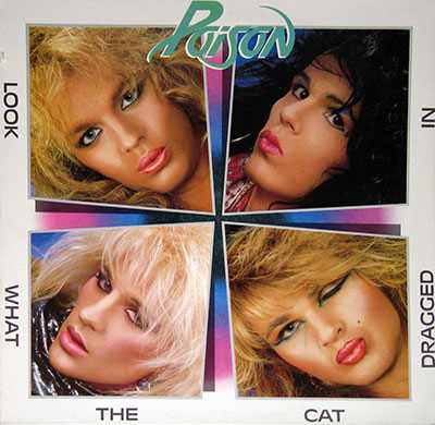
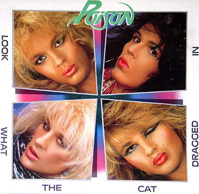
Coming off the momentum of "Look What the Cat Dragged In", the pressure wasn’t subtle: write bigger, sound bigger, sell bigger. That’s where Tom Werman enters the story—someone who knew how to turn a band’s raw energy into a stadium-friendly punch without sanding off all the troublemaker edges. With sessions tied to places like Conway Recording Studios and One on One Recording Studio, it’s got that late-’80s “we’re here to make a statement” sense of scale baked in.

The sound, songs, and musical direction

Sonically, this record lives on bright guitars, spring-loaded rhythms, and choruses engineered for maximum damage—in the fun way, not the hospital way. Songs like "Nothin' but a Good Time" and "Fallen Angel" are basically sugar-rush rock: fast, catchy, and impossible to ignore once they’re in your head. Then "Every Rose Has Its Thorn" shows the other side of the band—still glossy, still dramatic, but with that slow-burn emotional pull that made even tough guys pretend they had “dust in their eyes.”

Comparison to other albums in the same genre/year

If you drop this next to other 1988 heavy-hitters—think Bon Jovi’s "New Jersey", Guns N' Roses"GN'R Lies", Cinderella’s "Long Cold Winter", or Van Halen’s "OU812"—you can hear the same era-wide obsession with big moments and bigger hooks. What Poison brings that’s uniquely theirs is the grin: the sense that the band is in on the joke, even while they’re selling it like gospel. It’s less “cool pose” and more “party in progress,” and that’s why it aged better than some of its more self-serious peers.

Controversies or public reactions

The loudest controversy wasn’t even the music—it was the cover. Some retailers reportedly found the original artwork too “raunchy,” which is a very polite way of saying “people got nervous,” and that’s how you end up with a censored version that looks like it’s been grounded by a paintbrush. The funny part is that the censorship only added to the album’s legend; nothing sells rock & roll like someone trying to hide it.

Band dynamics and creative tensions

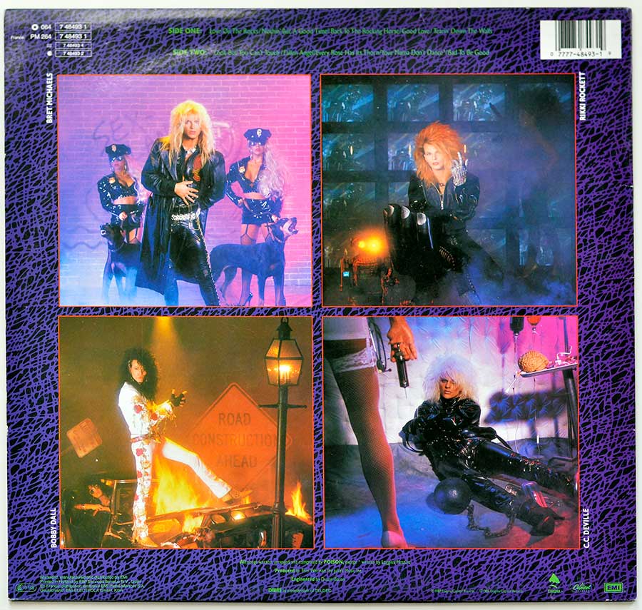
Albums like this don’t happen without a tightrope walk: stay dangerous enough to feel real, but polished enough to dominate airwaves. You can hear that balancing act in how the songs flip between swagger, sweetness, and pure cartoon-level fun—like four guys arguing in the studio, then agreeing on the chorus because the chorus pays the rent. The classic lineup—Bret Michaels, C.C. DeVille, Bobby Dall, and Rikki Rockett—sounds locked in, even when the vibe is half chaos, half calculation.

Critical reception and legacy

Back then, some critics treated glam metal like disposable party glitter; fans treated it like a lifestyle. This album ended up outlasting a lot of the sneering because the songwriting is simply built to stick—especially once "Every Rose Has Its Thorn" became a cultural flashlight song (you know the one: everybody suddenly has feelings). Today it’s widely regarded as a genre cornerstone, and on vinyl it still delivers that full-bodied, room-filling punch that streaming can only imitate.

Album Key Details: Genre, Label, Format & Release Info

Music Genre:

Hard Rock, Glam Metal

Label & Catalognr:

Enigma Capitol – Cat#: 1C 064-7 48493 DMM

Media Format:

Record Format: 12" Vinyl Stereo Gramophone Record
Total Weight: 230g

Year & Country:

1988 – Holland / Germany

Production & Recording Information:

Producers:
  • Tom Werman – Producer (for Julia's Music)

    Gloss-polisher-in-chief turning glam chaos into chart-grade shrapnel (with a grin).

    Tom Werman, on this album, I hear him taking Poison’s street-level swagger and snapping it into a glossy 1988 hit-machine. He keeps the guitars bright, the drums clean, and the choruses weaponized for radio and MTV—like confetti with a switchblade. The pacing stays tight, the ballad glow doesn’t turn to syrup, and the whole thing feels ‘big’ without losing its barroom grin. That’s producer muscle, not magic, and it shows.

Sound & Recording Engineers:
  • Duane Baron – Sound Engineer, Mixing Engineer

    Veteran sound engineer who helped define the polished muscle of ’80s and ’90s hard rock and metal.

    Duane Baron is a renowned sound engineer known for shaping the sound of iconic rock and metal albums. Working as both engineer and mixer, he played a key role in crafting records by artists such as Mötley Crüe, Ozzy Osbourne, Heart, and Alice Cooper. His ability to balance clarity, power, and radio-ready polish made him a go-to figure during the peak years of big-budget rock production.

Recording Location:

Conway Recording Studios, One on One Recording Studio

Photography:
  • Neil Zlozower – Rock Photographer

    The eye behind some of the most iconic hard rock and metal images of the ’70s and ’80s.

    Neil Zlozower is a legendary rock photographer whose raw, high-energy images helped define the hard rock and heavy metal scenes of the 1970s and 1980s. Best known for his close association with bands like Van Halen and Mötley Crüe, his photographs capture the unfiltered intensity, excess, and attitude of rock’s golden era. Decades on, his work remains a visual time capsule of loud amps and louder personalities.

  • Annemaria DiSanto – Photographer

    Inner-sleeve chaos captured on purpose—glam, sweat, and just enough sin to annoy the censors.

    Annemaria DiSanto, on this album’s sleeve and inner-sleeve shots, her camera sells the attitude before the needle even drops. She frames the band’s neon swagger with just enough danger to feel “forbidden,” which makes the later censorship look even funnier. Those images do real work here: they turn four guys and a pile of choruses into a full-blown late-’80s spectacle. You can practically smell the hairspray through the cardboard.

  • William Hames – Photographer

    Back-cover action shots that scream “arena-ready” even if you’re just holding it over the kitchen table.

    William Hames, on this album’s back-cover photography, he captures Poison in full strut—stage heat, poses, and that ‘we own 1988’ grin. The pictures make the record feel like a tour stop you can hold, not just a studio product. He leans into motion and flash, giving the sleeve that after-midnight energy the songs thrive on. It’s the visual equivalent of a shouted chorus: loud, shiny, and impossible to ignore across the record shop.

  • Sandra Johnson – Photographer

    Freeze-frames 1988 swagger like it’s evidence—big hair, big poses, zero subtlety (bless her).

    Sandra Johnson, on this album’s back-cover shots, she locks the band’s glam-metal confidence into crisp, replayable images. Her photos give the package momentum—like the sleeve is already mid-song, even before Side One starts spinning. The lighting and poses sell the ‘arena-ready’ myth that the production is pushing, and it works. Pure era-accurate swagger: big hair, bigger posture, and zero interest in subtlety (thankfully).

Models & Visual Credits:

Front cover model: Bambi

Back cover models: Mikki Shout, Lisa Buzelli, Cindy Rome, Candice Raquel

Album Packaging:

This album includes the original custom inner sleeve featuring album details, complete lyrics, and accompanying artwork and photography.

Band Members / Musicians:

Band Line-up:
  • Bret Michaels – Vocals

    Ringmaster vocals: turns bar-fight swagger into sing-along therapy, no refunds.

    Bret Michaels, on this album I hear him selling every chorus like it’s the last beer at closing time—half swagger, half wounded heart. His vocals keep the party tracks cocky and bright, then flip the switch on “Every Rose Has Its Thorn” and suddenly the room gets quiet. He’s the emotional glue here, steering the record from strip-club grin to lighter-in-the-air drama without losing the band’s smirk. That range is the hook.

  • C.C. DeVille – Guitars

    Lead-guitar firestarter: riffs sharp enough to cut hairspray—and somehow still radio-friendly.

    C.C. DeVille (real name Bruce Anthony Johannesson), on this album I hear him as the riff-slinger who keeps the sugar from turning to syrup. The guitars are bright, sharp, and built for big choruses, but there’s still bite in the attack—those little runs and squeals that make the hooks feel dangerous instead of polite. His playing gives “Nothin’ but a Good Time” its grin-with-teeth energy and keeps the whole record moving like it’s late for the next party.

Band Line-up:
  • Bobby Dall – Bass Guitar

    Bass anchor: keeps the whole glam circus from floating away on its own ego.

    Bobby Dall, on this album I feel him doing the unglamorous heavy lifting: bass lines that lock the songs to the floor so the choruses can jump around like idiots. He’s not trying to steal the spotlight; he’s making sure the spotlight doesn’t fall over. The low end stays tight and punchy, keeping the grooves rolling through the party cuts and giving the ballad space to breathe without collapsing into mush. Solid as a brick.

  • Rikki Rockett – Drums

    Drum engine: hits clean, fast, and mean—like a metronome that learned violence.

    Rikki Rockett (real name Richard Allan Ream), on this album I hear him as the engine room: crisp snare snaps, steady kick, and fills that shout “arena” without turning into a drum clinic nobody asked for. The tempos stay spring-loaded, pushing the fast tunes forward and keeping the mid-tempo stomp from dragging. His feel makes the band sound tight even when the vibe is pure cartoon excess—like a party held together with duct tape and perfect timing.

Complete Track-listing:

Tracklisting Side One:
  1. Love on the Rocks
  2. Nothin' but a Good Time
  3. Back to the Rocking Horse
  4. Good Love
  5. Tearin' Down the Walls
Video: Poison - Nothin' But A Good Time
Tracklisting Side Two:
  1. Look But You Can't Touch
  2. Fallen Angel
  3. Every Rose Has Its Thorn
  4. Your Mama Don't Dance
  5. Bad to Be Good
Video: Poison - Every Rose Has Its Thorn (Official Music Video)

Disclaimer: Track durations shown are approximate and may vary slightly between different country editions or reissues. Variations can result from alternate masterings, pressing plant differences, or regional production adjustments.

Album Front Cover Photo
Censored front cover of Poison’s 1988 vinyl album Open Up and Say... Ahh!, showing the band logo in bright green above a torn black strip revealing only a pair of vivid green eyes, with the rest of the original artwork obscured by solid black paint, a yellow hype sticker on the right, and the album title in handwritten-style yellow script at the bottom—an intentionally altered sleeve variant prized by collectors for its censorship and late-’80s glam metal design.

This is the censored front cover of Poison’s 1988 album “Open Up and Say... Ahh!”, presented as a standard 12-inch vinyl sleeve. The entire design is built around deliberate obstruction. Most of the original artwork has been aggressively overpainted in flat, matte black, creating a heavy visual block that dominates the sleeve and immediately signals controversy rather than subtlety.

At the top center, the Poison band logo appears in a bright acid-green color, slightly italicized and sharply outlined, floating against the black background. The color choice is loud and unmistakably late-’80s, designed to punch through record store lighting even from a distance. The logo is clean and untouched, emphasizing that the censorship targets the image below, not the band identity.

Cutting horizontally across the center of the sleeve is a rough, torn-looking strip where the black paint stops. Through this narrow opening, only a pair of intense, stylized eyes is visible. The skin around them is rendered in harsh red-orange tones, with heavy shadowing and graphic lines. The eyes themselves are an unnatural, glowing green, sharply focused and confrontational. This partial reveal is the key visual hook of the censored edition—it withholds just enough to provoke curiosity while making the act of censorship obvious and almost theatrical.

On the right side of the sleeve sits a round, bright yellow hype sticker. Its color contrasts violently with the black background, drawing immediate attention. The sticker text promotes chart success, explicitly calling out “No 1 Smash Hit Every Rose Has Its Thorn” and additional US Top 10 hits. From a collector’s standpoint, the presence and condition of this sticker matter; intact hype stickers like this significantly affect desirability and value.

Along the bottom, the album title “Open Up and Say... Ahh!” appears in a handwritten-style yellow script. The lettering feels loose and provocative, intentionally informal, reinforcing the album’s sexual innuendo and glam-metal attitude. Minor edge wear and faint surface scuffing are visible across the black areas, typical of a handled vintage sleeve, and useful indicators when assessing originality and storage history.

Overall, this sleeve is less about illustration and more about absence. The censorship becomes the design. For collectors, this version stands as a documented example of late-’80s retail pressure directly altering album art, making it a historically distinct and visually aggressive variant rather than a simple alternate cover.

Album Back Cover Photo
Back cover of Poison’s 1988 vinyl album Open Up and Say... Ahh!, featuring four separate framed photos of the band members in staged late-1980s glam-metal scenes, surrounded by a purple patterned border with track listings, credits, logos, and a barcode along the edges.

This is the back cover of the 1988 European censored vinyl edition of Poison – “Open Up and Say... Ahh!”. The entire layout is structured as a four-panel photo grid, each image boxed in a thin red frame and set against a purple, organic-patterned background that mimics cracked leather or reptile skin. The design is loud, busy, and unapologetically late ’80s—exactly the point.

The top-left photo is labeled vertically along the left edge BRET MICHAELS. He stands front and center in a black leather outfit, blond hair teased high, flanked by two women dressed as stylized police officers. Two Doberman dogs frame the scene, reinforcing the staged danger-and-sex appeal aesthetic that defined the band’s image at the time. Colored fog and a brick wall backdrop push the scene firmly into music-video territory rather than realism.

The top-right photo is labeled RIKKI ROCKETT. He appears mid-performance in a dark, smoky environment, red hair blown out dramatically, caught in motion under blue-tinted lighting. Multiple TV screens or stage panels glow behind him, reinforcing the MTV-era visual language where performance, video, and spectacle blur into one continuous image.

The bottom-left photo carries the vertical label BOBBY DALL. He is shown in a theatrical street-style setup, one foot raised as flames burn beneath him. A road sign reading ROAD CONSTRUCTION AHEAD is clearly visible behind him, functioning as both literal set dressing and visual metaphor. The lighting is warm and aggressive, with fire effects adding physical intensity to the otherwise staged pose.

The bottom-right photo is labeled C.C. DEVILLE. He lies restrained in a padded, clinical-looking room, dressed in glossy black leather. A woman’s leg and hand holding a device enter the frame from above, while surgical props—including a visible brain—sit on a tray in the background. This image leans heavily into shock imagery, dominance, and exaggerated provocation, echoing the controversy surrounding the album artwork as a whole.

Along the very top edge, small green text lists the complete track information. SIDE ONE reads: Love on the Rocks, Nothin’ But a Good Time, Back to the Rocking Horse, Good Love, Tearin’ Down the Walls. SIDE TWO reads: Look But You Can’t Touch, Fallen Angel, Every Rose Has Its Thorn, Your Mama Don’t Dance, Bad to Be Good. A barcode appears in the upper-right corner, confirming this as a commercial retail pressing.

Printed along the bottom margin in fine text are the production and copyright credits. These include: “All songs written, arranged and composed by POISON except ‘Every Rose Has Its Thorn’ written by Bret Michaels.” “Produced by Tom Werman for Julia’s Music Inc.” “Engineered by Duane Baron.” Manufacturing and distribution credits reference EMI, Electrola GmbH, and Enigma / Capitol Records, with DMM mastering by TELDEC. Logos for EMI, Enigma, Capitol, and related rights organizations appear along the lower edge, completing the formal documentation of the release.

From a collector’s perspective, this back cover is a time capsule of late-’80s glam-metal marketing: heavy staging, individual band branding, overt provocation, and dense printed information packed into every available inch of sleeve space.

First Photo of Custom Inner Sleeve
Lyrics side of the custom inner sleeve from Poison’s 1988 vinyl album Open Up and Say... Ahh!, showing dense white song lyrics arranged in narrow columns across a purple cracked-leather patterned background, with small inset band photographs bordered in red and minimal spacing, emphasizing heavy text content and late-1980s glam metal sleeve design.

This image shows one side of the original custom inner sleeve from the 1988 vinyl LP “Open Up and Say... Ahh!” by Poison. The sleeve is dominated by text, designed first and foremost as a functional lyrics sheet rather than decorative packaging. The entire surface is covered in a purple background patterned to resemble cracked leather or reptile skin, a recurring visual theme across the album’s packaging that ties the inner sleeve to the outer cover.

Across this textured background, the song lyrics are printed in tightly packed vertical columns using small, clean white type. The font is simple and highly legible, prioritizing readability over style. Each song title appears clearly separated, followed by full verses and choruses with almost no wasted space. From a collector’s perspective, this density matters: it confirms this is a full lyrics sleeve, not a trimmed or edited reissue variant.

The layout is divided logically by album sides and track groupings, allowing the reader to follow the running order without confusion. There is no illustration breaking up the text blocks; instead, the design leans into saturation, filling nearly every inch of the cardboard with information. This kind of heavy text coverage also makes condition issues easy to spot in real life—any creases, seam splits, or ring wear immediately interrupt the uniform pattern.

Scattered across the sleeve are small inset color photographs of band members, each framed by a thin red border. These images are intentionally secondary in scale, acting as visual punctuation rather than focal points. The photos show staged performance or promo-style shots consistent with late-’80s glam metal aesthetics, but they never overpower the lyrics themselves.

No barcode or catalog block appears on this side, reinforcing its role as the informational interior rather than a marketing surface. Overall, this inner sleeve represents a practical, era-correct design approach: lyrics first, visuals second, all executed with bold color choices and zero subtlety. For collectors, its presence, correct paper stock, and unaltered printing are essential markers of a complete original pressing.

Second Photo of Custom Inner Sleeve
Credits side of the custom inner sleeve from Poison’s 1988 vinyl album Open Up and Say... Ahh!, showing dense white production credits and acknowledgements printed in vertical columns on a purple textured background, surrounded by numerous small red-bordered color photos of band members, studio scenes, and lifestyle shots, with the Poison logo printed large at the bottom.

This image shows the reverse side of the original custom inner sleeve from Poison’s 1988 vinyl album “Open Up and Say... Ahh!”. Where the other side focuses on lyrics, this side is all about credits, acknowledgements, and visual excess. The background matches the rest of the package: a purple, cracked-leather style pattern that fills the entire sleeve and immediately places it in late-’80s glam-metal design language.

The central area is dominated by long vertical columns of small white text listing production credits, publishing information, management, legal representation, touring staff, equipment, and thank-you notes. The typography is compact and utilitarian, designed to fit an enormous amount of information into a limited space. This density is a key authenticity marker—any reprint or counterfeit usually simplifies or trims this text.

Scattered across the sleeve are numerous small color photographs, each framed with a thin red border. These images show the band members in a mix of candid and staged moments: riding motorcycles, posing with guitars, performing live, hanging backstage, and engaging in exaggerated lifestyle imagery typical of the era. The photos are intentionally irregularly placed, breaking up the rigid text columns and creating a chaotic, scrapbook-like effect.

Individual images vary in lighting and setting, suggesting they were pulled from different sessions rather than a single shoot. Some show outdoor daylight scenes, others capture stage lighting or studio environments. From a collector’s standpoint, these photos are crucial because they confirm this is the complete inner sleeve and not a stripped-down lyric-only insert.

Along the bottom edge, the Poison logo appears large and bold in bright green, cutting through the purple background. This anchors the design visually and mirrors the color used on the outer sleeve branding. Fine-print copyright lines, fan club information, and label logos appear nearby, completing the formal documentation of the release.

Overall, this side of the inner sleeve functions as a historical snapshot of the band’s operation at its commercial peak. For vinyl collectors, the presence, legibility, and paper condition of this credits-heavy side are essential indicators of a complete and well-preserved original pressing.

Close up of Side One record’s label
Close-up of the Side One vinyl record label from Poison’s 1988 album Open Up and Say... Ahh!, showing a dark grey label with the green Poison logo at the top, a narrow red strip revealing stylized green eyes across the center, the album title in yellow handwritten script below, and visible concentric grooves and spindle hole indicating a European pressing.

This image shows a close-up of the Side One record label from the censored European vinyl pressing of Poison – “Open Up and Say... Ahh!”, released in 1988. The label sits on a dark grey background that blends smoothly into the black vinyl surface, making the printed artwork appear embedded rather than sharply separated. Fine concentric groove lines are clearly visible around the label edge, confirming this is a photographed record in playing condition, not a flat scan or reproduction.

Dominating the top half of the label is the Poison band logo, printed in a vivid green with yellow outlining. The lettering is slightly italicized and stretched, a signature logo style that mirrors the outer sleeve branding exactly. Color consistency between sleeve and label matters to collectors, and here the green tone matches the cover art closely, indicating an original coordinated print run rather than a later mismatch.

Running horizontally across the center of the label is a narrow red image strip. Inside this strip are the same stylized, intense green eyes seen on the censored front cover, partially obscured by red facial tones and heavy black shadows. This visual continuity ties the censored sleeve concept directly to the record itself, making this label unique compared to standard label-only designs of the era.

Below the image strip, the album title “Open Up and Say... Ahh!” appears in a handwritten-style yellow script. The lettering is slightly irregular, mimicking a marker or paint-pen look, and contrasts sharply against the dark background. The placement is balanced and uncluttered, leaving space around the spindle hole and maintaining legibility even with minor surface wear.

The center spindle hole is cleanly punched, with no visible tearing, suggesting careful handling. Light surface reflections reveal faint sleeve scuffs typical of vinyl stored in a printed inner sleeve. From a collector’s perspective, this label confirms Side One orientation, pressing authenticity, and design continuity, making it a key detail shot when documenting a complete original censored European edition.

->
Close up of Side TWO record’s label
Close-up of the Side Two vinyl record label from Poison’s 1988 album Open Up and Say... Ahh!, showing a bright green label with full Side Two track listing, catalog number 1C 064-7 48493 1, GEMA/STEMRA rights text, DMM logo, Enigma and Capitol Records logos, and visible vinyl grooves confirming a European pressing.

This image shows a close-up of the Side Two record label from the censored European vinyl pressing of Poison – “Open Up and Say... Ahh!”, released in 1988. Unlike Side One’s graphic-heavy design, this label shifts to a more traditional information-first layout. The background is a solid, bright green, a color strongly associated with late-’80s Enigma and Capitol European pressings and immediately recognizable to collectors.

The left half of the label is dominated by the complete Side Two track listing, printed in clean black text with precise running times. The songs listed are “Look But You Can’t Touch,” “Fallen Angel,” “Every Rose Has Its Thorn,” “Your Mama Don’t Dance,” and “Bad to Be Good.” The typography is compact but legible, aligned vertically to maximize space while keeping each title clearly separated—an important detail when verifying pressing accuracy.

Above and to the right, technical and rights information is printed clearly: STEREO 33, GEMA/STEMRA, and the full European catalog number 1C 064-7 48493 1. These markings confirm this as a continental European release rather than a US domestic pressing. For collectors, this exact catalog formatting is a key identifier when distinguishing German/Dutch cuts from other variants.

The Poison logo appears on the right side, printed in yellow with a subtle outline, paired with the album title “Open Up and Say… Ahh!” beneath it. Production credits follow directly below, stating Produced by Tom Werman for Julia’s Music Inc. and Engineered by Duane Baron. These credits are sharply printed and centered, with no decorative elements competing for attention.

Along the lower portion of the label, multiple logos appear: the DMM (Direct Metal Mastering) mark, the Enigma logo, and the Capitol Records logo. These confirm the mastering process and label partnership used for this pressing. Around the outer rim, fine circular legal text is visible, following the curve of the label edge.

The center spindle hole is clean and well-centered, and faint sleeve scuffs are visible in the surrounding vinyl surface, consistent with careful handling. From a documentation standpoint, this Side Two label shot is essential: it verifies track order, mastering method, rights society, and catalog data, completing the visual record of an original censored European pressing.

All images on this site are photographed directly from the original vinyl LP covers and records in my personal collection. Image quality varies due to different cameras and lighting conditions used over the years. Images may be reused for non-commercial purposes with proper attribution; commercial use requires permission.

POISON (USA , Glam Metal) VINYL RECORDS And Album Gallery

POISON - Look What The Cat Dragged In ( Netherlands )
Thumbnail Of  POISON - Look What The Cat Dragged In ( Netherlands ) album front cover

Enigma 3202-1 / 08-023714-1 , 1986 , Holland

Poison's debut album, "Look What the Cat Dragged In," cemented their place as one of the most iconic bands of the hair metal era. Released in 1986 on Enigma Records, the album's vibrant cover art, infectious melodies, and raucous energy perfectly captured the spirit of '80s hard rock. The

Look What The Cat Dragged In ( Netherlands ) 12" Vinyl LP
POISON - Look What The Cat Dragged In ( Canada )
Thumbnail Of  POISON - Look What The Cat Dragged In ( Canada ) album front cover

Enigma / Capitol Records ST-12523 , 1986 , Canada

The album features the hit singles "Talk Dirty to Me," "I Want Action," and "I Won't Forget You," which helped to propel the band to commercial success. The album's sound is characterized by its heavy use of guitar riffs, catchy hooks, and flamboyant stage personas.

Look What The Cat Dragged In ( Canada ) 12" Vinyl LP
POISON - Open Up and Say AH (Uncensored)
Thumbnail Of  POISON - Open Up and Say AH album front cover

Enigma Capitol 1C 064-7 48493 DMM , 1988 , Holland / Germany

This album was banned somehow because some retailers objected to this sleeve on the grounds that it was too "raunchy". Whether you're a fan of glam rock, heavy metal, or just good old-fashioned rock and roll, this album has something for everyone. It remains one of Poison's most enduring works

Open Up and Say AH (Uncensored) 12" Vinyl LP
POISON - Open Up And Say Ah (Censored) album front cover vinyl LP album https://vinyl-records.nl

Enigma Capitol 1C 064-7 48493 DMM , 1988 , Germany and Holland

POISON - Open Up And Say Ah (Censored)

The censored European edition of "Open Up and Say... Ahh!" captures Poison at their late-’80s commercial peak, blending glam metal hooks with radio-ready production by Tom Werman. This controversial sleeve variant, altered for retail sensitivity, turned censorship into collector fuel and helped cement the album’s status as a defining 1988 hard rock release.

POISON - Swallow This Live
Thumbnail Of  POISON - Swallow This Live album front cover

Capitol Records 064-7 98038 , 1991 , Germany

"Swallow This Live" captures the essence of Poison's energetic stage presence by combining live recordings with studio tracks. The live portion of the album was meticulously captured in various locations, including Tampa, Miami, and Orlando, Florida.

Swallow This Live 12" Vinyl LP