Sepultura - Morbid Visions (1987, Germany) 12" Vinyl LP Album

- A primitive hellscape where early Sepultura spills blood and fire

Front cover of Sepultura - Morbid Visions vinyl sleeve: a black-bordered square cover with a large silver Sepultura logo across the top, a horned demon centered against a red-orange glow in the background, and three crucified bodies on wooden crosses across the foreground. White smoke-like streaks curl over the lower half above a cracked glowing ground, with the album title in jagged white lettering at lower left. Light edge wear, faint corner rubbing, and mild surface sheen are visible.

A horned demonic demon looms over a burning red horizon, flanked by three crucified bodies suspended on wooden crosses. Smoke-like energy curls around their bodies, while the ground splits open beneath them, glowing with molten light. The Sepultura logo hovers sharp and metallic above the chaos, with “Morbid Visions” scrawled in eerie white script below, completing a grim, infernal tableau.

Sepultura's "Morbid Visions" on Shark Records is a 12" vinyl LP pressing of their debut album. Originally released in 1986, this German pressing (1987) features their raw thrash metal sound with influences of death metal. It's a landmark album for the genre and includes tracks like "Troops of Doom" and "War."

"Morbid Visions" (1987) Album Description:

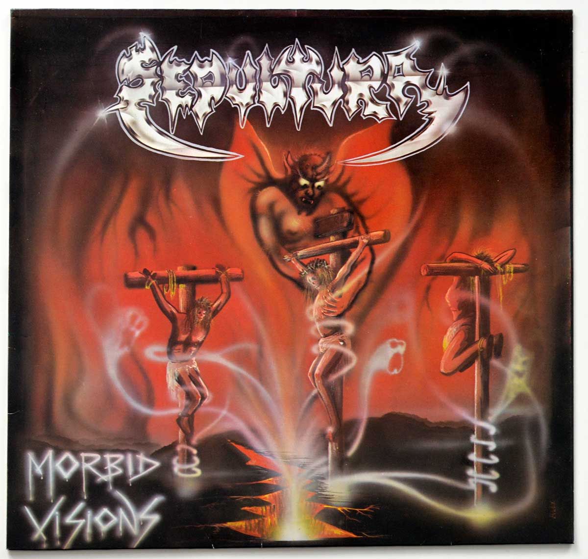
"Morbid Visions" is what Brazilian Thrash Metal sounded like before anybody had the money, the patience, or the bad judgment to clean it up. This West German Shark Records pressing catches Sepultura at the point where the band still felt more like a threat than a finished machine: Max Cavalera barking and hacking his way through riffs, Jairo T. Guedz spraying loose-edged lead guitar over the top, Igor Cavalera driving the songs with a young man’s sense of impact rather than finesse. Plenty of records from 1986 and 1987 wanted to look evil. This one actually sounds like it was made in a room that smelled of hot amplifiers, dust, and nerves.

What makes this album worth opening up is not just the noise. It is the mess around the edges: the Belo Horizonte scene that had to invent half its own infrastructure, the German Shark issue that sits in a very different collector lane from the earliest Brazilian copies, the line-up still hardening under your hands, and a sleeve that practically shouts before the needle drops. Dig a little deeper and the record gets stranger, meaner, and more human than the usual lazy "primitive first album" label suggests.

Belo Horizonte in the mid-1980s was not exactly rolling in spare cash, polished rehearsal spaces, or major-label couriers. That scarcity matters. The local metal scene grew on tape trading, stubbornness, photocopied attitude, and the useful absence of outside supervision. Cogumelo did not wave a magic wand over Sepultura; it did something more practical and more valuable. It helped get the band on record and out into circulation, which is how this rough little beast escaped Brazil and started gnawing at the international underground.

Set this beside Slayer, Venom, Sodom, Kreator, Hellhammer, or the earliest Celtic Frost and the differences show up fast. Slayer had sharper attack and far more control. Sodom and Kreator were already pushing German thrash toward a harsher, drilled violence. Venom was chaos with theatre attached. Sepultura, at this stage, sounds more cramped than all of them, more boxed in, more feral, and a good deal less interested in appearing competent for its own sake. That is not a weakness here. It is the whole atmosphere.

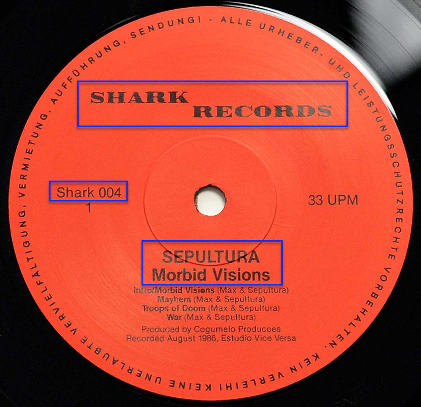
The sound itself is dry, scraping, and narrow in a way that suits the material. Eduardo Santos and Zé "Heavy" Luiz did not turn this into studio furniture; they kept the attack intact, while L. W. Alps Becher III helped stop the mastering from falling apart altogether. Recorded at Estudio Vice Versa in August 1986, the album never opens out into big theatrical space. It presses inward. Guitars rub against the drums, vocals sit like hot grit on top, and the whole record feels as though it was trapped in the room with the band and told to cope.

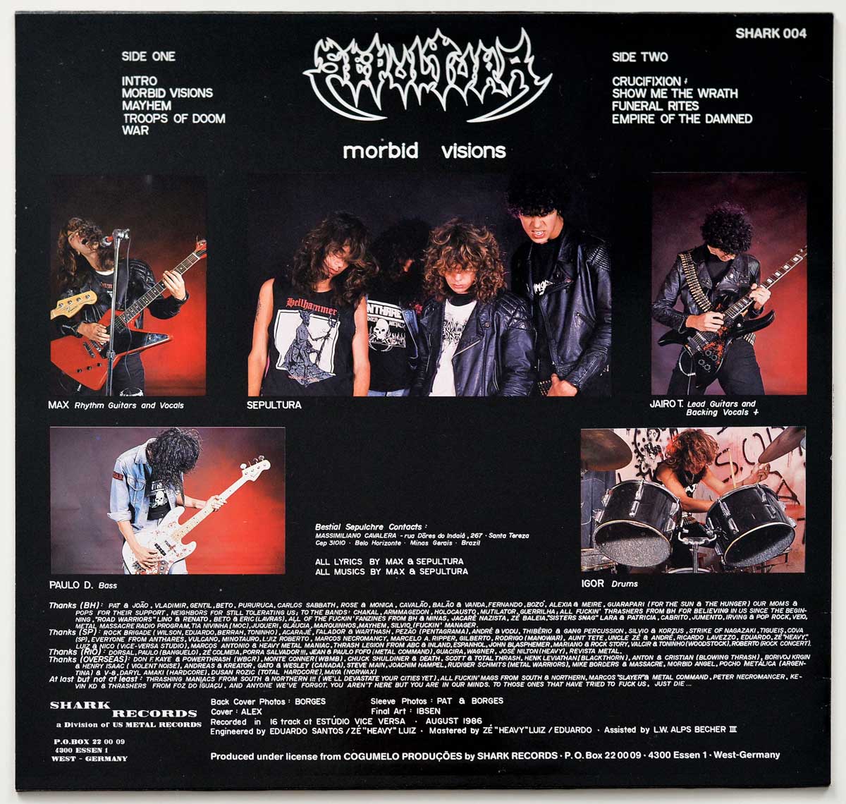
Max is the centre of gravity, no question, but not in the later iron-willed way people tend to remember. Here he sounds hungry, volatile, still shaping his method in real time. Jairo T. Guedz is just as crucial. His lead work adds that unstable early-Sepultura character, the sense that the solos might either rip the song open or crash headfirst into the wall. That looseness disappears once the band moves into a more disciplined frame of mind, and there are days when I prefer this awkward danger to the cleaner command that came later. Not every listener will agree. Tough.

Igor Cavalera’s drumming is another big part of why the album still lands. There is no slick trickery to hide behind, just blunt force, speed, and the sort of instinctive push that makes a young thrash record feel alive instead of merely fast. Bass on these earliest Sepultura recordings has always carried a faint haze around it in fan conversations, and that kind of confusion is common when bands come out of small scenes with limited resources and even more limited paperwork. What matters on the actual record is the physical result: low-end pressure, not virtuoso display.

No major scandal hangs over "Morbid Visions" itself, despite the usual outsider panic about demons, crosses, and adolescent blasphemy. The real misconceptions are duller and more persistent. One is that every copy of this album lives in the same collector world. It does not. Another is that this was already the fully armed Sepultura of later years. It was not. This is a band still learning how to turn obsession into form, which is exactly why the album keeps its bite.

Tracks like "Troops Of Doom" and "Show Me The Wrath" carry the record because they understand movement. The riffs do not just chug along like dutiful thrash homework; they lurch, bite, and surge forward with that slightly off-balance feel that gives early extreme metal its real pulse. Even the rougher cuts matter because they thicken the mood. Nothing here sounds curated. It sounds thrown together under pressure by people who believed that atmosphere could cover for any technical shortfall, and damned if they were not right more often than they were wrong.

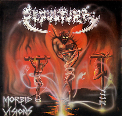
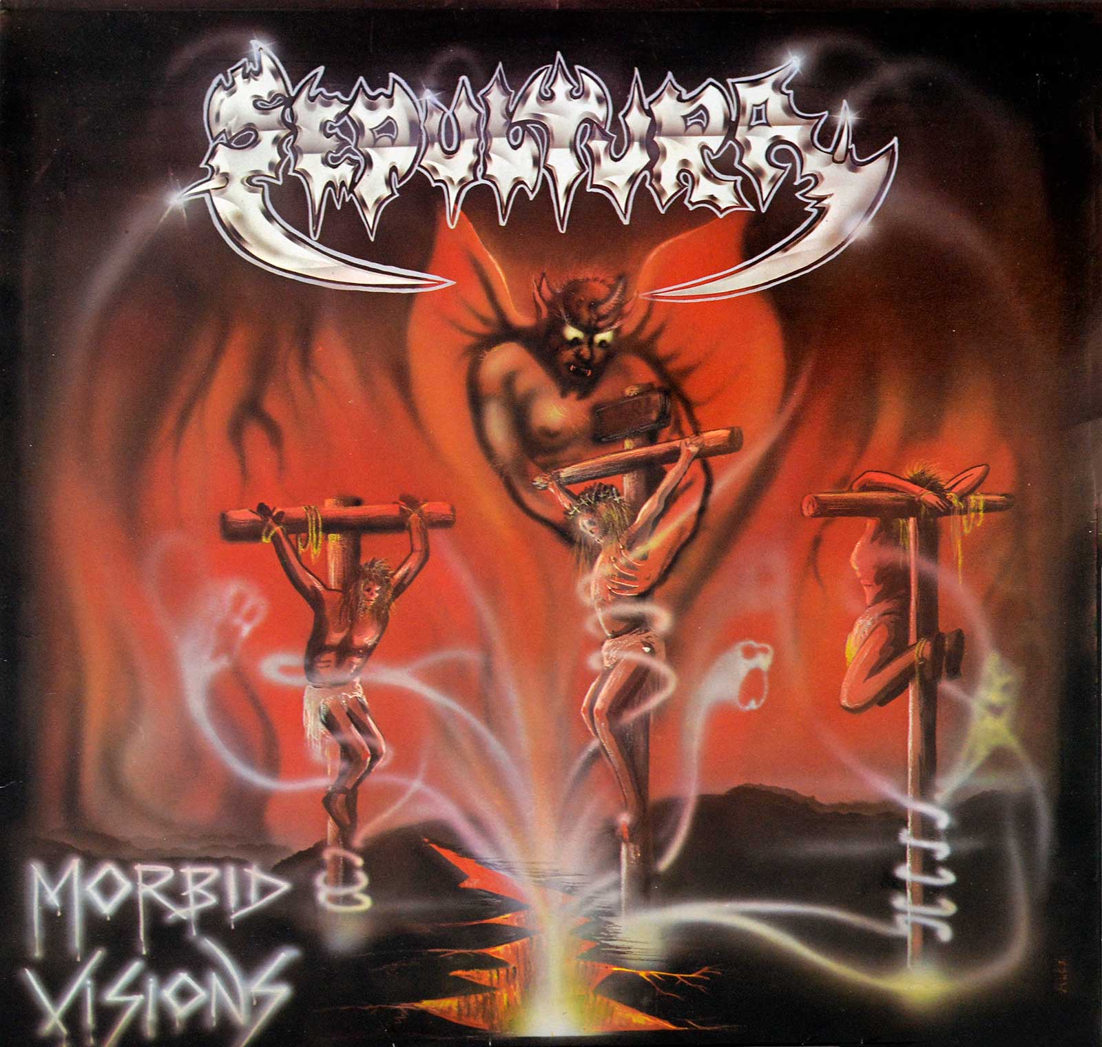
The Shark Records sleeve helps too. Alex and Ibsen did not package this album as a tasteful artefact; they pushed it toward lurid excess, which was the correct decision. On a late shelf under bad fluorescent light, the silver logo and red-orange inferno do exactly what they should do: they pull the eye before the music gets a chance. A copy like this always reminds me of those last ten minutes in a record shop when you are supposed to be leaving, but one nasty-looking sleeve keeps whispering, "Not yet."

That is why this German pressing still earns space. Not because it is flawless. Not because it predicts every strength the band would later sharpen. It earns space because it catches the sound of a scene pushing outward through bad conditions, a young band still rough at the joints, and a form of Brazilian Thrash Metal that had more heat than polish and more nerve than manners. Some records arrive dressed for history. This one arrives with ash on its boots.

References

Album Key Details: Genre, Label, Format & Release Info

Music Genre:

Thrash, Speed Metal

Label & Catalognr:

Shark Records – Cat#: SHARK 004

Media Format:

Record Format: 12" Vinyl Stereo Gramophone Record
Total Weight: 230g

Release Details:

Release Date: 1987

Release Country: Germany

Production & Recording Information:

Producers:
  • COGUMELO Productions – Producer

    The Belo Horizonte underground did not build itself.

    COGUMELO Productions, the independent Belo Horizonte label that grew out of a specialist rock shop and became one of the real launch pads for Brazilian extreme metal, gave this album the backing it needed when that scene still smelled of rehearsal rooms, xeroxed flyers and stubborn nerve. On "Morbid Visions" its contribution was simple but crucial: put Sepultura on record, push the material into circulation, and help turn local menace into something the wider tape-trading world could not ignore.

Sound & Recording Engineers:
  • Eduardo Santos – Sound and Mastering Engineer

    One of the technical hands that kept early Brazilian metal from collapsing into pure mud.

    Eduardo Santos, an engineer credited here for both sound and mastering duties, helped shape the kind of rough, cramped, abrasive sonics that suit this record far better than any clean studio gloss ever could. On "Morbid Visions" the job was not to make Sepultura elegant. Quite the opposite. Guitars scrape, drums hit hard without much polish, and the whole thing keeps that boxed-in pressure-cooker feel that makes the album sound dangerous instead of tidy.

  • Zé "Heavy" Luiz – Sound and Mastering Engineer

    Not a decorative credit, but one of those names wired deep into Brazil’s metal machinery.

    Zé "Heavy" Luiz, a Brazilian audio engineer and producer with long ties to metal on stage and in the studio, brought the sort of practical aggression this album needed. On "Morbid Visions" he shared the engineering and mastering load, helping keep the attack intact instead of sanding it down for respectability. That matters. The riffs still bite, the vocals feel half-spat through clenched teeth, and the record keeps its raw nerve rather than turning into a weak studio compromise.

  • L. W. Alps Becher III – Assistent Mastering Engineer

    A small credit on paper, though these are often the hands that stop chaos from becoming unusable.

    L. W. Alps Becher III, credited as assistant mastering engineer, sits in that familiar collector territory where the name is easy to overlook and the contribution is not. On this album the role was part support, part damage control: help carry the rough mix into a playable master without stripping out its grime. That balance is the whole trick here. "Morbid Visions" still sounds primitive and unruly, but it holds together enough to hit like a record instead of a rehearsal tape.

Recording Location:
  • Estudio Vice Versa – Recording Location

    No luxury bunker here, just the kind of room that leaves its fingerprints all over a record.

    Estudio Vice Versa, the Belo Horizonte studio used for the August 1986 sessions, was the place where this album’s early feral character got pinned to tape. On "Morbid Visions" the room matters almost as much as the songs. Nothing feels oversized or pampered. The sound is narrow, dry, and grimy in exactly the right way, with the instruments pressing against each other instead of floating in expensive studio air. That physical tightness is part of why the record still feels hungry.

Album Cover Design & Artwork:
  • Alex – Cover

    The cover comes from the old underground instinct to disturb first and explain never.

    Alex, credited for the cover, supplied the visual front door to this record’s rotten little world. That matters more than people admit. On "Morbid Visions" the sleeve does not act like tasteful packaging; it throws you straight into the album’s primitive satanic atmosphere before the needle even lands. The image is rough, lurid, and slightly unhinged, which is exactly right. A cleaner concept would have betrayed the music. This one meets it head-on with proper underground bad intent.

  • Ibsen – Album Artwork

    Final art work is where raw ideas either survive the print process or die looking polite.

    Ibsen, credited with the album artwork, handled the finished visual side that carried the cover concept into the actual sleeve collectors know. On "Morbid Visions" that contribution sits in the details: how the image reads on paper, how the layout holds together, and how the whole package keeps its nasty little mood without slipping into accidental comedy. That balancing act is not glamorous, but it matters. The artwork lands as underground menace rather than just adolescent noise thrown at cardboard.

Photography:
  • Borges – Photography

    The best metal photography rarely flatters; it catches a band before polish ruins the evidence.

    Borges, credited for photography, helped supply the visual proof that early Sepultura were still operating from instinct, attitude, and whatever resources were lying around. On this album the photographic contribution fits the music perfectly: no glamour, no major-label posing, no fake mystique polished to death. The images support the sleeve with a rough documentary feel, the sort of band photography that tells a collector more than a press release ever will about time, place, and scene.

  • Pat – Photography

    Another quiet visual credit, though these quieter names often hold the whole sleeve together.

    Pat, credited for photography, added to the sleeve imagery that frames this record as a real artifact from the Belo Horizonte underground rather than some later cleaned-up myth. On "Morbid Visions" that contribution works because it stays grounded. The photos do not oversell the band. They give the package texture, human presence, and a sense of scene, helping the visual side carry the same raw honesty as the music itself. That kind of restraint usually ages better than anything trying too hard.

Band Members / Musicians:

Band Line-up:
  • Max Cavalera – Vocals, Guitars

    Sepultura’s founding voice and riff engine already sounded like he was trying to claw through the speakers.

    Max Cavalera, Brazilian vocalist, guitarist and co-founder of Sepultura who later pushed his career further through Soulfly, Nailbomb and Cavalera, gives "Morbid Visions" its rabid centre of gravity. Those rhythm guitars are crude in exactly the right way, all jagged pressure and no wasted decoration, while the vocals come out half bark, half possessed spit. Nothing here sounds trained or polite, and that is the whole point. He turns the album’s limitations into menace.

  • Jairo T. Guedz – Lead Guitars

    Early Sepultura needed danger more than finesse, and Jairo brought exactly that loose-edged chaos.

    Jairo T. Guedz, Brazilian guitarist whose career runs through Sepultura, The Mist, Eminence and later The Troops of Doom, is all over the early DNA of this record. On "Morbid Visions" his lead work never tries to sound elegant; it tears, scrapes and lurches through the songs with that unsteady underground feel collectors recognize in a second. That roughness is not a flaw to tidy up. It is one of the reasons this album still reeks of rehearsal room heat and young bad intent.

 
  • Paulo Jr. (Paulo Xisto Pinto Jr.) – Bass Guitar

    One of those names tied to Sepultura’s identity from the start, even when the early recording details stay a bit murky.

    Paulo Jr. (Paulo Xisto Pinto Jr.), Brazilian bassist and Sepultura mainstay who later became the band’s longest-serving member, belongs to this early line-up like rust belongs to old steel. Around "Morbid Visions" the low-end history has always had a bit of fog around it, which is common enough in these primitive first-generation metal recordings, but his presence in the band’s formation years still matters. He is part of the album’s original body language: lean, hostile, and held together by nerve rather than luxury.

  • Igor Cavalera – Drums

    Barely out of childhood here, yet already hitting like someone trying to start a fight with the kit.

    Igor Cavalera, Brazilian drummer and Sepultura co-founder who later carried that same restless energy into Cavalera projects and beyond, gives this album its stubborn forward shove. On "Morbid Visions" the drumming is primitive, frantic and wonderfully unrefined, with fills that feel more instinctive than calculated. That is why it works. The kit does not sit back and decorate the riffs; it drives at them, pushes the songs into the red, and helps make the whole record feel young, reckless and genuinely alive.

Complete Track-listing:

Tracklisting Side One:
  1. Intro
  2. Morbid Visions
  3. Mayhem
  4. Troops Of Doom
  5. War
Video: Sepultura - Troops of Doom
Tracklisting Side Two:
  1. Crucifixion
  2. Show Me The Wrath
  3. Funeral Rites
  4. Empire Of The Damned
  5. Outro
Video: Sepultura - Show Me the Wrath

Disclaimer: Track durations shown are approximate and may vary slightly between different country editions or reissues. Variations can result from alternate masterings, pressing plant differences, or regional production adjustments.

You can tell straight away this isn’t some polished major-label job. The front cover has that slightly washed-out print, like the blacks never fully settled into the paper. Edges show a bit of wear, nothing dramatic, just honest mileage. Flip it over and the typography feels cramped, almost squeezed into place, typical of smaller label layouts trying to fit too much in. The label itself is where it gets interesting—ink looks a touch uneven, and the contrast isn’t razor sharp. That’s the charm. Not perfect, but real. Dig deeper into the gallery, especially the label close-ups, and you’ll start spotting the small pressing quirks collectors quietly obsess over.

Album Front Cover Photo
Front cover of Sepultura - Morbid Visions vinyl sleeve: a square black-bordered cover with the silver Sepultura logo across the top, three crucified bodies in the foreground, and a horned demon looming in a red-orange background above a split glowing ground. Album title appears lower left in jagged white lettering. Light corner wear, slight edge scuffing, and mild surface glare are visible on the sleeve.

First thing that hits me is the logo, and it is doing a lot of the heavy lifting. Huge, silver, sharpened to a ridiculous point, hanging over the whole scene like it wants top billing from the devil himself. Underneath it, the cover turns into pure underground excess: a horned demon in the middle distance, half lost in a red-orange blur, while three bodies are tied to rough wooden crosses across the foreground. No subtlety here. Good. This record was never going to survive a tasteful sleeve.

Closer up, the painting gets messier in ways I actually like. The demon is soft around the edges, almost airbrushed into the background, which makes the central body on the cross look more immediate and a bit nastier. White smoke or spirit trails curl all over the lower half and cut across the scene in a way that feels half deliberate, half like the artist got carried away and nobody in the room thought stopping was necessary. That usually ends badly. Here it works, mostly because the whole sleeve already lives in bad taste and knows it.

Physical details tell the usual truth. The black border around the sleeve has light rubbing along the edges, especially where hands would grab it from a shelf. Lower left shows a small scuff and a faint nick near the edge, not dramatic, just the sort of wear these matte-dark sleeves collect while pretending they are tougher than they are. Top edge has a little whitening too. Surface gloss catches the light in soft streaks, so the printed blacks do not sit perfectly flat. Cheap print? Probably. Honest print? Definitely.

The title down in the lower left looks like it was scratched in with a cold finger: "Morbid Visions" in jagged white lettering, slightly glowing, slightly awkward, and far more memorable than it has any right to be. Best part of the design, frankly. The split ground at the bottom, glowing orange through a black crust, gives the sleeve a needed anchor because otherwise the whole thing would drift off into painted smoke and adolescent blasphemy. Plenty of sleeves from this era lie for a living. This one does not. It shouts, overreaches, smudges its own eyeliner, and somehow comes out feeling more convincing because of it.

Album Back Cover Photo
Back cover of Sepultura - Morbid Visions vinyl sleeve: a black layout with white track listings at top left and top right, Sepultura logo and album title centered near the top, five color band photos arranged across the middle, dense white credits text across the lower half, and Shark Records production details along the bottom. Light edge wear, faint corner rubbing, and slight surface sheen are visible on the sleeve.

Turn the sleeve over and the whole thing tightens up into a far more practical piece of work. Front cover was busy playing satanic theatre; the back cover gets on with the job. Black background, white text, band logo shoved across the top, track lists split left and right, catalog number in the upper corner like a clerk muttering from behind a counter. No elegance, no wasted room. Everything is packed in because sleeves like this were expected to carry information, photographs, credits, thanks, and a bit of chaos besides. That is part of the charm. Also part of the annoyance.

Middle section is given over to band photos, and these are exactly the kind of mid-80s metal shots that age better than they should. Leather jackets, flying hair, instruments held at angles that make no practical sense outside a photo session, and that painted red studio backdrop trying its best to look infernal on a budget. Best image is probably the drummer shot on the lower right, because it actually feels alive. The posed central group picture is the usual stiff business, though that stiffness tells the truth too. Young band, small budget, big ambition, no stylist hovering nearby to save anyone from themselves.

Physical details are where this sleeve starts talking properly. White text remains sharp against the black, but the black field itself shows faint handling sheen and a few soft rub marks where fingers have done their usual damage over the years. Corners are lightly blunted, especially the upper ones, and the top edge has a little whitening creeping through. Tiny stress along the spine side too. Nothing tragic. Just real shelf wear, the sort that tells me the sleeve has been pulled out, read, shoved back, and not treated like some sacred museum relic in polyester prison.

Lower half is a glorious traffic jam of names, thanks, addresses, recording notes and production credits, all in that familiar tiny type collectors end up squinting at like monks over forbidden scripture. Frankly, it is a mess. A useful mess. "Shark Records" anchors the bottom left in big type, then the smaller credits tumble across the width with barely a breath between them. Love that sort of thing when it is legible, curse it when it is not. This one lands somewhere in the middle. Still, as a back cover it earns its keep: track layout clear, personnel visible, production details intact, and just enough clutter to remind me this came from an era when sleeves worked for their living.

Close up of Side One record’s label
Close-up of Side One record label for Sepultura - Morbid Visions: a bright red-orange Shark Records paper label centered on black vinyl, with SHARK RECORDS in large black text across the upper half, catalog number Shark 004 and side number 1 at left, 33 UPM at right, and SEPULTURA Morbid Visions with four track titles printed below the spindle hole. Fine concentric pressing rings, light spindle wear, slight print softness, and faint surface marks are visible.

Now this is where the collector part of my brain wakes up properly. Sleeve art can posture all it likes, but the label is where the record starts telling the truth. Bright red-orange paper. Almost aggressive. Shark Records splashed across the top in heavy black type that looks slightly rough at the edges, as if the ink never quite settled cleanly. Good. Too many labels from this period try to look sharper than the budget allowed. This one does not bother pretending.

The layout is plain in that stubborn old-school way: catalog number off to the left, speed on the right, band and album title planted below the spindle hole, then the tracks stacked underneath without any decorative nonsense. "Intro/Morbid Visions", "Mayhem", "Troops of Doom", "War". Straight to business. The center hole shows a bit of wear around the edge, exactly what should be there on a record that has actually been played instead of worshipped from inside a plastic sleeve like some nervous modern relic.

Pressing rings show up clearly when the light catches them, circling out from the middle like faint contour lines. Always worth looking at. The black vinyl around the label is glossy enough to reflect, though not so glossy that it hides the fine hairline traces and light handling marks sitting on the surface. Nothing ugly. Just use. Text sharpness is a little inconsistent too, especially in the larger Shark Records lettering, where the edges feel slightly softened. That sort of tiny imperfection is exactly the stuff that separates a real object from a cleaned-up scan trying to pass for one.

Best detail on this label, frankly, is how little it tries to charm anyone. German legal text runs around the outer rim in a full ring, cramped and stern, while the rest of the space is given over to facts: title, credits, recording note, production line. No flashy logo tricks beyond the obvious one. No visual sugar. Slightly mechanical, slightly cheap, completely right for the record. A label like this does not sell fantasy. It confirms the pressing, shows the hierarchy of information, and quietly tells me this copy belongs on the turntable, not in some glass coffin with a smug little price tag next to it.

All images on this site are photographed directly from the original vinyl LP covers and record labels in my collection. Earlier blank sleeves were not archived due to past storage limits, and Side Two labels are often omitted when they contain no collector-relevant details. Photo quality varies because the images were taken over several decades with different cameras. You may use these images for personal or non-commercial purposes if you include a link to this site; commercial use requires my permission. Text on covers and labels has been transcribed using a free online OCR service.

Sepultura: Brazil's Metal Pioneers Tackling Social Issues and Pushing Boundaries in Music Since 1984

Thumbnail of SEPULTURA - Arise (1991 Netherlands) album front cover
SEPULTURA - Arise

Arise is the fourth studio album by Brazilian thrash metal band Sepultura, released in 1991 through RoadRace Records. Upon its release, the album received top reviews from heavy metal magazines such as Rock Hard, Kerrang! and Metal Forces

Arise (1991 Netherlands) 12" Vinyl LP
Thumbnail of SEPULTURA - Arise ( 1992 The Netherlands )      album front cover
SEPULTURA - Arise

This Maxi-Single contains three tracks. The track "Arise" was recorded during the European "Arise" tour on 31st May 1991. The tracks "Inner Self" and "Troops Of Doom" have not been previously released.

Arise ( 1992 The Netherlands ) 12" Maxi
Thumbnail of SEPULTURA - Beneath The Remains ( 1989 Poland )    album front cover
SEPULTURA - Beneath The Remains ( Two International Versions )   12" Vinyl LP

"Beneath the Remains" , which is the third studio album and major label debut by Brazilian thrash metal band Sepultura, released on 7 April 1989. It was recorded during the second half of December 1988 at Nas Nuvens Studio in Rio de Janeiro (Brazil)

"Beneath the Remains" Dutch (Netherlands) Release "Beneath the Remains" Polish Release
Thumbnail of Sepultura - Mass Hypnosis Promo Karregat Eindhoven Chicago  album front cover
Sepultura - Mass Hypnosis

The album features two separate live sets. The A-side throws listeners into the mosh pit at Chicago on November 18th, 1989. This was likely during Sepultura's "Beneath the Remains" tour

Mass Hypnosis Promo Karregat Eindhoven Chicago 12" Vinyl LP
SEPULTURA - Morbid Visions album front cover vinyl LP album https://vinyl-records.nl

Crude, filthy, fast: the kind of thrash LP that never learned manners

SEPULTURA - Morbid Visions

I do not reach for "Morbid Visions" when I want finesse. I reach for it when I want raw thrash filth, riffs that scrape like rusted steel, and vocals that sound as if Max Cavalera is trying to tear holes in the sleeve. Igor keeps the whole racket moving with pure youthful violence. This German pressing preserves that primitive attack beautifully, or horribly, which in this case is the same thing.

Updated SEPULTURA - Roots album front cover vinyl LP album https://vinyl-records.nl

The Day Thrash Metal Learned to Stomp

SEPULTURA - Roots

I still remember when "Roots" landed in 1996 and the thrash crowd collectively went: what the hell just happened? Sepultura slowed the tempo, cranked the groove, and turned thrash into a tribal stomp. "Roots Bloody Roots" smashes the speakers, while "Ratamahatta" feels like a street brawl on tape. Max Cavalera growls, Igor hammers the drums, and the whole thing still rattles my shelves.

Thumbnail of SEPULTURA - Schizophrenia (Two Versions) album front cover
SEPULTURA - Schizophrenia (Two Versions) 12" Vinyl LP

It is the first album of Sepultura with Andreas Kisser. This album marks a real change for the band as it shows they can write more elaborated material than the raw Death Metal of their debut.

Schizophrenia German Release Schizophrenia Netherlands Release
Thumbnail of SEPULTURA - Slave New World , Orange Vinyl  album front cover
SEPULTURA - Slave New World

This Orange Colour Vinyl and Extended Play record if "Slave New World" by the Brazilia Thrash Metal band Sepultura. Sepultura covers three songs from the bands: Ratos de Porao, Dead Kennedys and Motörhead.

Slave New World , Orange Vinyl 10" EP
Thumbnail of SEPULTURA - Under Siege (Regnum Irae) album front cover
SEPULTURA - Under Siege (Regnum Irae)

Sepultura's "Under Siege (Regnum Irae)," a 12" Vinyl Maxi-Single released in 1991 in Holland, holds a distinct place. This release, a powerful manifestation of the band's musical prowess

Under Siege (Regnum Irae) 12" Maxi Single