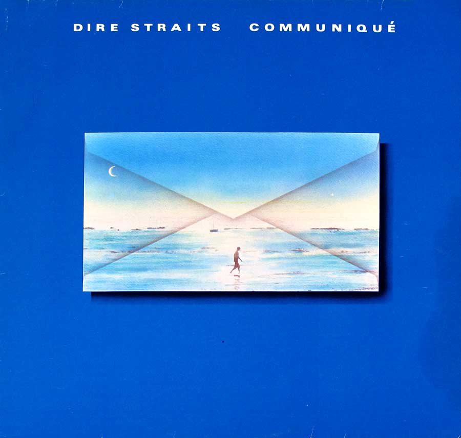
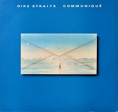
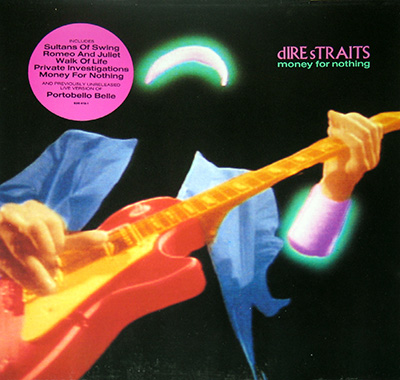
- The Cool Blue Classic That Quietly Reshaped Late-70s Rock
Dire Straits' “Communiqué” continues the band’s rise from smoky London clubs to international recognition, wrapped in a cool blue sleeve that perfectly matches its understated, nocturnal charm. This German 1979 release blends Mark Knopfler’s clean guitar narratives with laid-back grooves and a production style shaped by Jerry Wexler and Barry Beckett. The calm confidence of the album makes it a collector’s favourite, especially with its original inner sleeves and Vertigo UFO-themed label artwork.
“Communiqué” landed in 1979 like a postcard from a band that suddenly found itself famous, exhausted, and still pretending none of this bothered them. The album feels like Dire Straits stepping out of the smoky pubs of their debut and blinking into the bright light of world expectation. It’s understated, confident, and suspiciously calm — the kind of calm you get right before a long storm of success.
Late-seventies Britain was wobbling between economic gloom and musical reinvention. Punk had already kicked the doors in, disco was busy filling dancefloors, and Blondie, The Police, and Supertramp were reshaping the charts. In that chaos, Dire Straits kept doing the most rebellious thing imaginable: staying quiet, precise, and emotionally literate. “Communiqué” reflects that energy — not trendy, not flashy, just quietly brilliant.
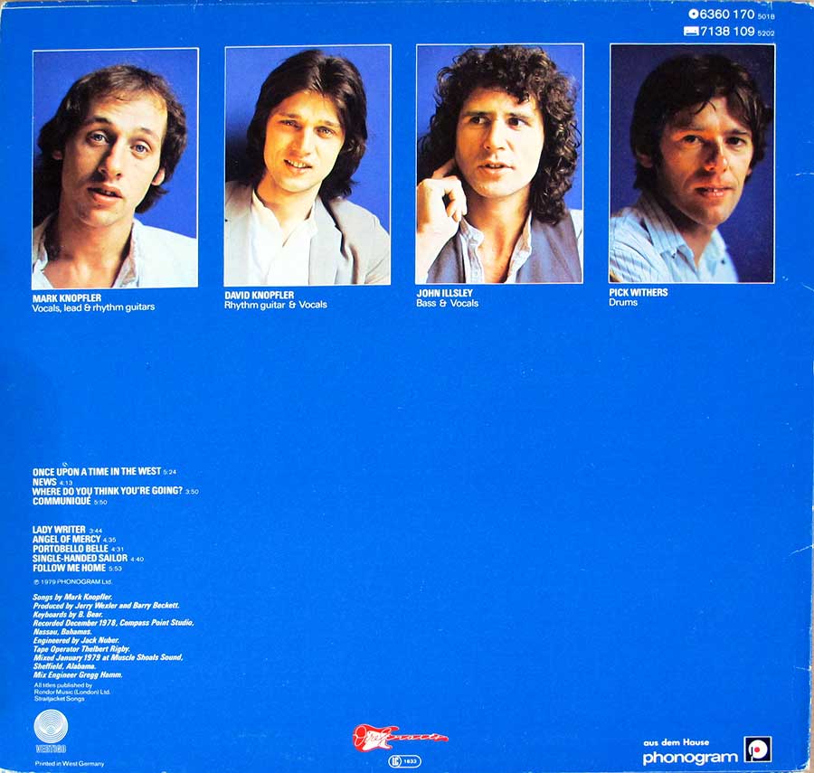
The band had barely recovered from the whirlwind success of their debut when the label nudged them back into the studio. One year earlier they were scraping pounds together; now they were shipped off to Compass Point Studios in the Bahamas, where the sun shines much brighter than London pubs ever do. Knopfler was suddenly a songwriter in demand, the band was navigating fame at high speed, and deadlines were no longer suggestions. “Communiqué” became the sound of a group trying to keep their footing while the ground kept sliding forward.
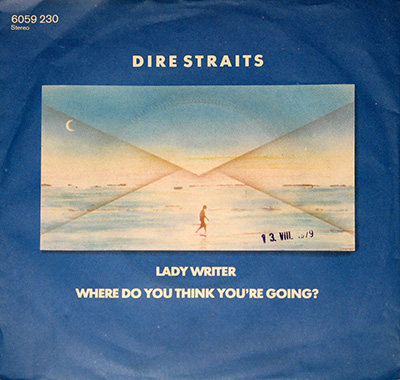
Musically, the album settles into a confident mid-tempo groove — all clean guitars, warm bass, and that unmistakable Knopfler narrative drift. It’s music that doesn’t need to raise its voice because the stories do the heavy lifting. Tracks like “Once Upon a Time in the West” and “Lady Writer” show the band refining the cinematic, slow-burn style that would later make them stadium giants. Even the quieter songs feel like they’re wandering through soft-lit streets, half-memory, half-dream.
Compared to what else 1979 was serving — Pink Floyd’s grand theatrics, AC/DC’s blunt force riffing, and the pop elegance of Fleetwood Mac — “Communiqué” chose the road less frantic. It’s a sibling of albums that preferred mood over muscle, like “Breakfast in America” or “Regatta de Blanc.” Dire Straits didn’t try to outshine their peers; they opted to outlast them with understatement.
The album dodged big controversies, unless you count critics complaining that the band sounded “too similar” to their debut. Some called it a repeat performance; others just turned it up and enjoyed the ride. In hindsight, the real “controversy” was that Dire Straits refused to reinvent themselves every six months — they simply kept polishing what worked.
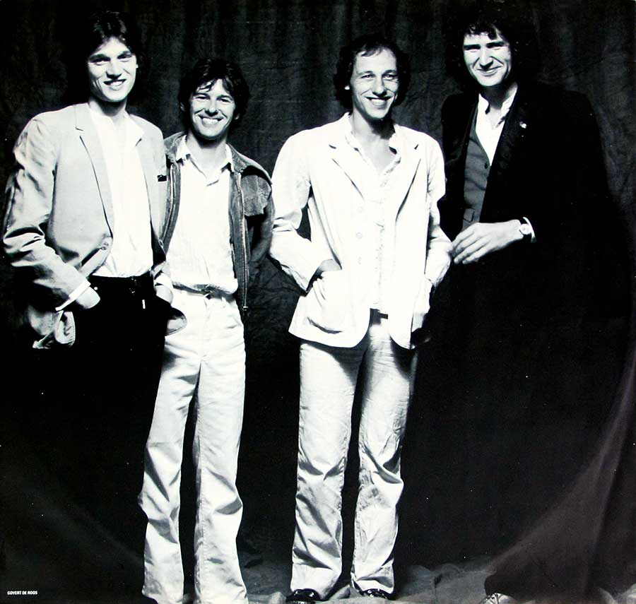
Inside the band, however, the pressure was starting to cook. Touring was endless, fame was unevenly distributed, and two brothers in the same band is always a delicate chemical experiment. You can almost feel David Knopfler slipping into the background, Mark taking firmer command, and the whole machine tightening its bolts before the big albums still to come.
Reception at the time was warm but cautious — fans loved the consistency, critics wanted more fireworks. Decades later, the same album feels wiser and more patient than anyone realized. These songs have aged like late-night conversations: soft around the edges, full of detail, quietly unforgettable.
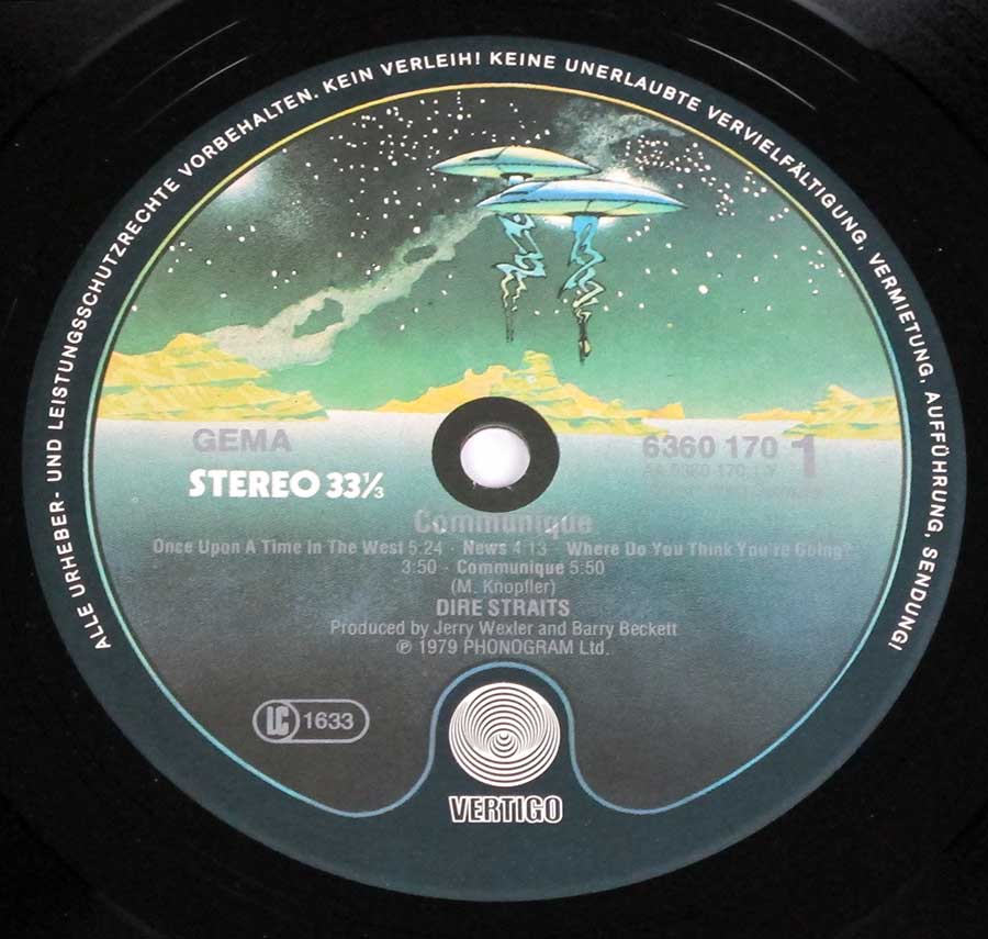
Slip the record out of its German sleeve today and it still exudes that cool, unhurried confidence. No drama, no gimmicks — just four musicians sketching stories across clean grooves. After all these years, “Communiqué” still sounds like a message sent from a calmer world… one we wouldn’t mind revisiting.
Classic Rock / Pop-Rock
A smooth blend of rock and melodic pop elements, Classic Rock and Pop-Rock combine tight songwriting with clean guitar tones and understated rhythms. Dire Straits’ subtle arrangements and narrative lyrics defined this refined late-1970s sound.
Vertigo – 6360 170
Original custom inner sleeve with large photos of the Dire Straits band members.
Embossed outer sleeve. Clean typography and minimalist design.
Record Format: 12" Vinyl Stereo Gramophone Record
Total Weight: 230g
1979 – West-Germany
Muscle Shoals Sound Studios – Sheffield, Alabama
Spinning “Communiqué” feels like sitting in a half-lit room at midnight — guitars whispering stories while the world outside fades into static.
Note: Track durations are not listed on this edition. Minor pressing and mastering variations may exist between French and Dutch issues.
The front cover of Communiqué presents a striking field of deep, velvety blue, clean and uninterrupted except for the centered envelope illustration. The design feels deliberately quiet, the kind of quiet that invites you in rather than shouts for attention—perfectly aligned with Dire Straits’ understated personality at the end of the 1970s.
The envelope itself blends realistic folds with a surreal landscape painted across its surface: a lone figure walking along a pale shoreline, the wet sand reflecting soft twilight colors. A slim crescent moon hangs in the corner, casting a sense of solitude and distance. The whole image plays on the idea of a message delivered across time and space, a visual metaphor echoing the album’s title.
The minimalist typography—simply “DIRE STRAITS” and “COMMUNIQUÉ” spaced widely along the top—keeps the focus on the artwork, letting the sea, sky, and envelope shape speak for themselves. Subtle shadows give the illustration a slight lift from the background, almost as if the envelope were physically resting on the cover.
The design has become iconic not because it is loud, but because it whispers. Its calm, dreamlike quality mirrors the album’s tone—steady, reflective, and quietly confident. This German pressing preserves the artwork’s crisp contrasts and cool color palette beautifully.
The back cover of Communiqué is built around four evenly spaced portrait photographs of the band, each framed in white against a smooth blue background that matches the front sleeve. Mark Knopfler appears first, relaxed and slightly unguarded, followed by David Knopfler with a softer expression. John Illsley’s photo is more intense, while Pick Withers closes the row with a calm, focused look.
Below the portraits, the deep blue field continues uninterrupted, creating a clean stage for the album’s tracklist and production notes. The song titles are printed in crisp white type, aligned neatly along the left side, with the timings and arrangement mirroring the album’s understated design philosophy.
Production and recording credits sit just beneath the tracklist, referencing the Compass Point Studios sessions in the Bahamas and the mixing work completed in Alabama. The bottom edge of the sleeve carries the Phonogram and Vertigo identifiers, along with the German pressing indicators, grounding this edition firmly in its late-70s European release context.
The overall layout feels deliberate and steady—no elaborate artwork, no flamboyant band posing—just four musicians presented plainly, matching the precise, unfussy character of the music within. The cover captures the essence of Dire Straits at the time: confident, authentic, and refreshingly free of theatrics.
This full-page black-and-white inner sleeve photo presents Dire Straits in a relaxed, unpolished moment that feels closer to a candid studio snapshot than a staged portrait. The band stands shoulder-to-shoulder before a dark, softly wrinkled backdrop, giving the image a simple, documentary character.
David Knopfler stands on the far left, tall and easy-going in a light blazer, his hands tucked casually in his pockets. Next to him, Pick Withers wears a denim jacket and beams with an open, genuine smile, bringing warmth to the composition. Mark Knopfler, positioned slightly forward, appears in a pale suit, hands in his pockets, radiating the understated confidence that defined the band’s early years.
On the far right, John Illsley adds contrast with a darker jacket and vest, his posture relaxed but upright, grounding the right edge of the frame. The differences in clothing tones create a pleasing visual rhythm, subtly guiding the viewer’s eye from left to right across the group.
The photo captures a rare sense of intimacy—four musicians at the start of something big, still carrying the humility and closeness of their pub-gig days. The absence of elaborate styling lets their personalities shine, making this image one of the most authentic glimpses into the band’s early chemistry during the Communiqué period.
This second inner sleeve photo set presents four black-and-white portraits arranged neatly in a square grid, each framed with thin black lines against a clean white background. The layout continues the understated, documentary-like visual style used throughout the Communiqué packaging, emphasizing the individuality of each band member.
In the upper-left portrait, Mark Knopfler appears relaxed and approachable, smiling gently while wearing a dark tank top, giving the image an informal, personal feel. The upper-right features John Illsley in a more introspective moment, his face partially lit, his expression serious and contemplative.
The lower-left image shows David Knopfler in soft, natural light, turning his gaze sideways as if caught mid-thought, the photo highlighting his quieter presence within the band. The lower-right portrait captures Pick Withers in a loose, casual pose, his shirt slightly open, hair tousled, radiating calm confidence.
Beneath the portraits, small text credits the contributing photographers and designers, including Barry Schulz, Alan Schmidt, and Geoff Halpin. The typography and spacing remain minimal, allowing the portraits themselves to carry the emotional weight. Together, these images offer an intimate, unembellished snapshot of Dire Straits at a formative moment in their early career.
This Side One label presents Vertigo’s distinctive late-70s illustrated design: a softly airbrushed seascape blending pale green, turquoise, and warm yellow tones, fading into a star-dotted night sky. Hovering above the horizon are two stylized UFO-like crafts with metallic blue bodies and tapered beams, giving the artwork a surreal, retro-futuristic flair that contrasts sharply with the band’s understated musical tone.
The label text is cleanly printed, with GEMA on the left, the Stereo 33⅓ speed marking beneath it, and the tracklist positioned centrally in neat, even line spacing. On the right sits the German catalog number 6360 170-1, confirming this pressing as a West German Vertigo issue. The bottom portion displays the iconic Vertigo swirl logo—a hypnotic black-and-white spiral symbolizing the label’s identity since 1969.
Around the outer rim, German-language copyright text warns against unauthorized reproduction, broadcasting, or public performance. Production credits for Jerry Wexler and Barry Beckett appear just above the logo, along with the © 1979 Phonogram notice. The overall print quality is crisp, typical of Vertigo’s high-standard German pressings from this era.
The combination of detailed illustration, precise typography, and clear catalog information makes this a model example of Vertigo’s late-70s aesthetic—collectible both for its sonic history and its unique sci-fi visual character.
This Side One label belongs to Vertigo’s illustrated UFO-landscape series used on West German pressings in the late 1970s. The design merges surreal artwork with clear, highly legible production information, making it both visually distinctive and functionally precise. This particular label design was used by Vertigo between 1977 and 1980.
The Dire Straits album pages in this collection trace the band’s climb from smoky London pubs thick with the smell of beer and after-hours chatter to the bright glare of world stages. Each record in thisvinyl records discography captures that same working-class pulse — guitars that whisper more than shout, lyrics that sketch city nights and worn-out hearts. It’s a chronicle of restraint and rhythm, of songs aged well because they were never chasing style. What follows brings that slow-burn rise into clear focus, one clean chord at a time.
"Alchemy: Dire Straits Live" perfectly encapsulates the energy and musical virtuosity of a Dire Straits concert. The album was recorded during their 1983-1984 "Love Over Gold" tour
Alchemy Live 2LP (1984 France)
'Brothers in Arms' on 12" Vinyl LP is a sonic masterpiece produced by Mark Knopfler and Neil Dorfsman. This iconic album showcases the band's musical prowess and includes hits like 'Money for Nothing'.
Brothers in Arms (1985, Holland) Brothers in Arms (1985, West-Germany)
"Communiqué" is listed in three versions: European, German, and a rare Club Edition, each offering a unique experience on 12" vinyl LP.
Communiqué European Release Communiqué (1979, Germany) Communique Club Edition (1979, Germany)
The self-titled debut album of "Dire Straits" is available in four distinct versions, including the rare Portuguese edition, which is notably elusive to find.
DIRE STRAITS - Self-Titled (1978, England) DIRE STRAITS - Self-Titled Black Vertigo (1978, France) DIRE STRAITS - Self-Titled (1978, France) DIRE STRAITS - Self-Titled (1978, Portugal)
Vertigo 609 230 , 1979 , Germany
"Lady Writer" by Dire Straits is a captivating musical gem. Featuring the hit "Lady Writer" on one side and "Where Do You Think You're Going?" on the other, this release showcases the band's signature sound
Learn more
Warner Bros WBMS 109 , 1979 , USA
The rare promotional 12" Vinyl LP album, "Dire Straits - Live Promo - Warner Bros Music Show", offers a unique glimpse into the band's live performances.
Learn more
"Love Over Gold" the Dutch and West-German editions each having different coloured record labels , the West-German release mentions "Digital Recording".
Love Over Gold OIS (Netherlands) Love Over Gold (West-Germany)
The Dutch, German and USA release of "Making Movies" produced by Mark Knopfler and Jimmy Iovine and engineered by The Shelly Yakus, it features custom inner sleeves with lyrics and artwork. Recorded in July-August 1980
German Edition of Making Movies Dutch Edition of Making Movies Making Movies Genuine USA Edition
Vertigo INT 836 419 , 1988 , UK
"Money for Nothing" is a musical treasure with a mix of studio and live tracks. It features the iconic "Sultans of Swing", a live version of "Portobello Belle", and a remix of "Twisting by the Pool".
Learn moreDire Straits’ final studio album, On Every Street (1991), blends refined rock craftsmanship with introspective songwriting. This Holland pressing stands out for its 40-page world tour booklet and official merchandise leaflet, making it a must-have vinyl for collectors and fans of Mark Knopfler’s signature sound.
Vertigo 6863 201 , 1982 , France
The French Promo 12" Vinyl Maxi-Single of "Telegraph Road" by Dire Straits is a highly sought-after collector's item. Featuring a rare 14:37 version of the song, it predates the official release of the LP "Love Over Gold".
Learn more
The Netherlands release of the 12" EP "Twisting By the Pool" by Dire Straits features a concise tracklist. The Fren ch Edition also includes the bonus track "Badges, Posters, Stickers, T'Shirts"
Twisting By the Pool / ExtendedancEPlay (1983, France) Twisting By the Pool / ExtendedancEPlay ( 1983 Holland )