Deep Purple - Machine Head (1972, Italy) 12" Vinyl LP Album

- That warped mirror shot that made every band suddenly look too clean

Album Front cover showing a distorted mirror reflection of the band members, their faces stretched and blurred across a metallic surface, with the embossed Deep Purple Machine Head title above, creating a cold, industrial and slightly unsettling visual effect

What you’re looking at isn’t a photo in the usual sense—it’s a reflection, and a slightly dishonest one at that. The band appears stretched, smeared, almost melted across a polished metal surface, like reality couldn’t quite hold them still. Faces blur into each other, outlines dissolve, and the whole image feels cold and metallic, almost industrial. The embossed lettering sits above it all, sharp and confident, while the figures below look like ghosts caught mid-movement. It’s not clean, not flattering, and definitely not accidental—that warped reflection gives the whole sleeve a strange tension, like something solid just started to shift.

Deep Purple – "Machine Head" didn’t just land in 1972—it kicked the door off its hinges and left the room ringing. This is where hard rock stopped flirting with heaviness and just went all in, loud, lean, and unapologetically sharp-edged. You can feel it straight away: the engine-rev surge of “Highway Star,” the slow-burn swagger of “Lazy,” and yes, that riff from “Smoke on the Water” that every beginner murders but nobody forgets. The sound isn’t polished—it’s tense, dry, almost impatient, like the band knew something was about to explode and hit record anyway. Self-produced and stubbornly direct, it carries the chaos of Montreux in its bones. Even on this Italian gatefold, you’re not just holding a record—you’re holding a moment where rock music got a little louder and a lot less polite.

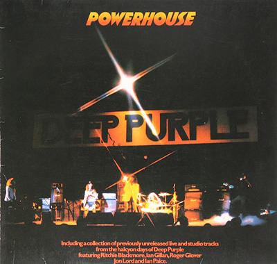
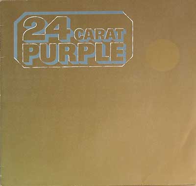
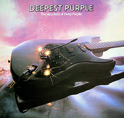
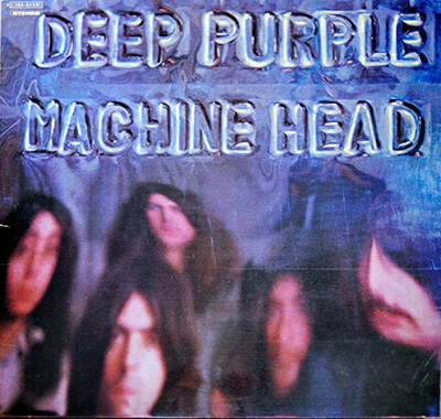
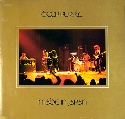
"Machine Head" Album Description:

Some albums arrive like a career move. "Machine Head" arrived like a hard shove. Deep Purple had already made plenty of noise before 1972, but this was the record where the noise tightened its jaw and started walking with purpose. Hard rock was getting heavier, meaner, less decorative, and this album sits right in that changeover point like it owns the place. Fair enough. It mostly does.

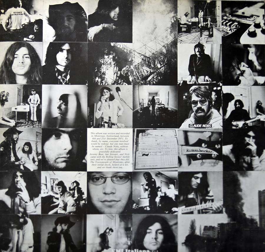
The circumstances helped, though not in the tidy myth-making way people like to repeat. The band went to Montreux to record, watched the casino burn, then relocated to the Grand Hotel and got on with it using the Rolling Stones Mobile Studio. That matters because the album sounds like a group forced to stop fussing. Dry drum crack. Organ with actual weight. Blackmore’s guitar cutting across the room instead of floating prettily above it. Self-produced too, which explains why nobody bothered smoothing the corners.

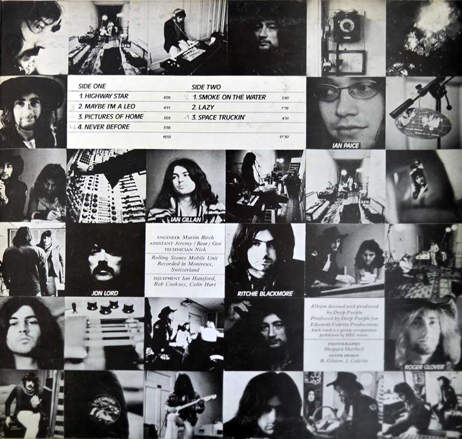
By the time a copy of this album first hit my hands, the usual suspects had already turned “Smoke on the Water” into a cliché for beginners, which is always the quickest route to underestimating a great record. Annoying, really. Because the album itself is not a one-riff souvenir. “Highway Star” opens like an engine being pushed past good sense, “Lazy” sprawls with that wonderful half-drunken confidence only this line-up could carry, and “Space Truckin’” ends the whole thing with a grin that feels slightly unhinged. Even “Maybe I’m a Leo” moves with that sly, heavy swagger people forget to mention because they are too busy worshipping the obvious.

What still works is the physical feel of it. Jon Lord’s organ does not decorate the riffs; it leans into them and makes them thicker. Ian Paice keeps everything moving without sounding mechanical, which is harder than the air-guitar brigade imagines. Gillan, meanwhile, sounds like he is enjoying himself just enough to be dangerous. There is no studio perfume over any of it. No polite distance. The whole album feels close to the sleeve, close to the room, close to the sort of volume that makes furniture reconsider its purpose.

Commercially, this was the one that pushed Deep Purple into the bigger league whether the critics liked it or not. It reached No. 1 in the UK and climbed to No. 7 in the US, where it hung around the Billboard chart for 118 weeks, which is not the sort of thing that happens by accident. And no, that was not only because of “Smoke on the Water.” The record had muscle all the way through. People heard that.

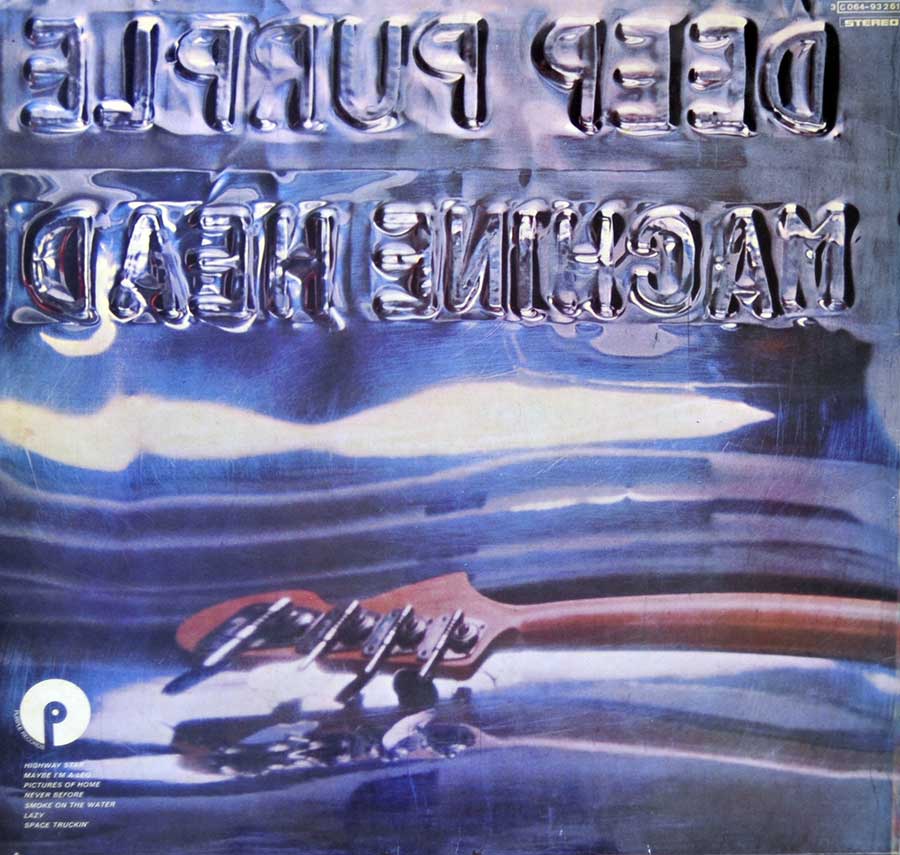
The Italian gatefold does not need a trumpet fanfare from me. It just suits the album. A record this forceful ought to feel substantial when you hold it, and this edition does. That is enough. "Machine Head" is not a monument because textbooks say so; it is a monument because once it is on, most of the room’s other options start looking weak.

References
Smoke on the Water's history

Some songs arrive with a biography already attached to them. “Smoke on the Water” dragged its own one in behind it, scorched and smelling faintly of bad luck. By the time I first heard it, the riff had already been butchered by every second-rate guitarist with three working fingers, which is usually the quickest way to forget how nasty and effective it sounded in the first place. On "Machine Head", it still has weight. Still moves like heavy equipment.

The story is better than most because it was not cooked up by a publicist. Deep Purple had gone to Montreux in December 1971 to record at the casino using the Rolling Stones Mobile Studio, only to watch the place burn during a Frank Zappa and the Mothers concert after some idiot fired a flare gun into the ceiling. That part matters. Rock history is full of legends that feel airbrushed after the fact. This one starts with stupidity, smoke, scrambling, and a band suddenly needing a new room.

They ended up at the Grand Hotel, closed for the winter, turning corridors and empty rooms into a recording space. That is the bit I always like best. Not the slogan, not the mythology—the image of a proper band making do, cables everywhere, cold air outside, a mobile truck parked there like a lifeline. “Smoke on the Water” came out of that mess with the riff intact and the lyric looking straight at what happened instead of dressing it up. Gillan did not write poetry here. He wrote eyewitness notes with a snarl.

Blackmore’s riff is the whole argument in four blunt moves. No acrobatics. No decorative nonsense. Just a hard shape you can recognize through a bad radio, a half-broken cassette deck, or the wall of a neighbor’s bedroom in 1978. That is probably why it lasted. The title itself is usually credited to Roger Glover after seeing the smoke drift over Lake Geneva, which is a lot better than pretending lightning struck a notebook.

One thing the old summary versions usually mangle: the song was on "Machine Head" in 1972, but it did not become the big single straight away. “Never Before” went out first. “Smoke on the Water” grew legs through radio, audience memory, and sheer refusal to disappear, then got its stronger chart push in 1973. That feels right somehow. The song had to stalk around for a while before the industry caught up.

What keeps it alive is not mystique. It is the lack of perfume. The lyric names names, the band hits the groove without fuss, and the whole thing sounds like men who had just watched their plans go up in flames and decided to turn the inconvenience into a permanent nuisance for everyone else. Good. Rock songs should occasionally keep their teeth.

References

Album Key Details: Genre, Label, Format & Release Info

Music Genre:

British Hard Rock

British Hard Rock in the early 1970s was loud, unapologetic, and built on sheer muscle. This is where blues roots got cranked through Marshall stacks until they turned into something sharper, heavier, and far less polite. Riffs became weapons, drums hit harder, and keyboards like the Hammond organ added a thick, almost orchestral punch. It is the sound of bands pushing past rock into something that would soon be called heavy metal, whether they liked the label or not.

Label & Catalognr:

Purple – Cat#: 3C 064 93261

Album Packaging

Gatefold/FOC (Fold Open Cover) Album Cover Design with artwork / photos on the inside cover pages

Media Format:

Record Format: 12" Vinyl Stereo Gramophone Record
Total Weight: 290g

Release Details:

Release Date: 1972

Release Country: Italy

Production & Recording Information:

Producers:
  • Deep Purple – Producer

    Five men, one shared nerve, and enough confidence to self-produce without asking the room for permission.

    Deep Purple, the Mark II line-up that had already pushed British hard rock into heavier and less polite territory, produced "Machine Head" themselves for Edwards Coletta Productions. That decision is all over the record: the sound stays dry, loud, and stubbornly direct, with the band trusting its own feel instead of sanding the edges off. Nothing here sounds over-managed; it sounds like a group that knew exactly when to hit and when to leave the bruise.

Sound & Recording Engineers:
  • Martin Birch – Producer, Sound Engineer

    I first noticed Martin Birch on those early Iron Maiden sleeves—the ones with the typography that felt like a threat. At twelve, I didn’t care about "production value"; I just liked that the guitars didn't sound like mud. He was the man behind the sound mixer, the one who made the snare snap like a dry branch in a cold forest. He was "The Headmaster," and we were all just students of his high-voltage curriculum.

    Birch didn’t just record noise; he organized aggression. By 1972, he was already wrangling the messy brilliance of Deep Purple’s Machine Head, turning Ian Gillan’s banshee wails into something that didn't just clip the tape but lived inside it. In 1980, he pulled off the ultimate renovation, giving Black Sabbath a much-needed shower and a new spine. Heaven and Hell shouldn't have worked, but Martin polished that Birmingham sludge into something operatic and gleaming. It was a pivot that felt like fate, mostly because he refused to let the mid-range get lazy.

    Then came the long, obsessive stretch with Iron Maiden from 1981 to 1992. It was a twelve-year marriage to the fader. From the moment Killers (EMC 3357, for those who care) hit the shelves, the sound was physical. He knew how to let Steve Harris’s bass clatter like a machine gun without drowning out the melody—a sonic miracle that still feels fresh. You can almost smell the ozone and the dust on the Marshall stacks when the needle drops on The Number of the Beast. He stayed until Fear of the Dark, then simply walked away. No victory lap, no bloated memoir. He preferred the hum of the desk to the noise of the crowd, leaving us with nothing but the records and a slight sense of abandonment. But then, when you’ve already captured lightning on tape for twenty years, why bother hanging around for the rain?

  • Jemery "Bear" Gee – Sound Engineer

    Assistant engineers rarely get the glory, which is absurd once a record sounds this locked in.

    Jemery "Bear" Gee, credited here as assistant engineer, belonged to that essential class of studio workers who kept difficult recordings from turning into expensive disasters. On "Machine Head" his contribution sat in the practical trenches beside Martin Birch, helping hold together a remote Montreux setup that needed speed, discipline, and very little fuss. Records with this much punch do not come from inspiration alone; somebody had to keep the machinery, the tape, and the moment from slipping sideways.

Recording Location:
  • Montreux, Switzerland – Recording Location

    A resort town is not supposed to sound this dangerous, which is probably why it worked.

    Montreux was better known for scenery, wealthy calm, and festival glamour than for a hard rock band trying to trap controlled violence on tape. For "Machine Head" the place became part of the story after the casino fire forced Deep Purple to regroup and record at the Grand Hotel with the Rolling Stones mobile unit. That detour gave the album room to breathe, a live feel without studio suffocation, and one of rock’s most overplayed but still untouchable origin stories.

Album Cover Design & Artwork:
  • Roger Glover – Cover Design

    Bass players who think visually tend to leave fingerprints where other people only leave credits.

    Roger Glover, Deep Purple’s bassist, songwriter, and one of the sharper practical minds in the band, never felt limited to the low end. On "Machine Head" he co-designed the sleeve and helped turn a smart visual trick into something collectors still stop and stare at: that mirrored metal image that looks cold, warped, and faintly hostile. Perfect fit. The cover does what the music does—invites you in, then keeps a bit of menace in reserve.

  • John Coletta (1932-2008) – Cover Design

    Managers with art-school instincts are a rare breed, and usually more useful than the men in suits pretending to be visionaries.

    John Coletta (1932-2008), Deep Purple’s longtime manager, came with a background in typography, graphics, and illustration, which explains why his design credit actually means something. On "Machine Head" he co-shaped the sleeve with Roger Glover, helping frame that reflected-metal concept into a cover that looked stranger and more severe than the average band portrait. Good call. The artwork feels tactile, a little sly, and exactly right for a record with this much steel in it.

Photography:
  • Shepard Sherbell – Photography

    A good rock photographer catches posture, tension, and accident, not just faces.

    Shepard Sherbell, an American photographer and journalist with a strong run of late-1960s and early-1970s music portraits to his name, knew how to make famous people look slightly unsettled. For "Machine Head" he photographed the band’s reflection in the polished metal sheet used for the cover, giving the image that warped silver glare collectors never forget. Even the faint trace of the photographer in the finished shot improves it; a little human imperfection never hurt a great sleeve.

Band Members / Musicians:

Band Line-up:
  • Ian Gillan – Vocals

    Fun bit: the guy who hit those stratospheric notes also played Jesus (1970) before he went full purple thunder.

    Ian Gillan, the razor-throated storyteller who helped turn Deep Purple into a stadium engine (1969–1973), then came back for the 1984 reunion and later tours. Before the purple thunder I cut my teeth in Episode Six (1965–1969). In 1970 I also sang Jesus on the original "Jesus Christ Superstar" album—pure theatre, no cape. I went jazz-rock with the Ian Gillan Band (1975–1978), cranked it harder with Gillan (1978–1982), and even took a wild detour fronting Black Sabbath on "Born Again" (1983). Solo records and guest spots followed, but that operatic scream and sly phrasing always gave the game away, whether I was whispering a blues line or detonating a high note over a Marshall stack.

  • Ritchie Blackmore – Guitarist, Songwriter

    The guy who made the guitar sound both medieval and radioactive, often in the same solo.

    Ritchie Blackmore is the sort of name I see on a sleeve and instantly expect sparks: born Richard Hugh Blackmore (1945), he’s an English guitarist who helped hard-rock riffing grow teeth and then politely refused to stop. His era-stamps are basically whole chapters of rock history: Deep Purple (1968–1975, 1984–1993), where the riffs got louder, sharper, and more dramatic; Rainbow (1975–1984, 1993–1997), where he leaned into melody and fantasy like it was a weapon; and Blackmore’s Night (1997–present), where the electric storm calms down into Renaissance-folk textures without losing that unmistakable Blackmore touch. I love that arc: from amp-stacks and arena thunder to lutes-and-candles vibes, like he just swapped dragons for different dragons.

    "Blackmore Signature Strats" I’ve spent too many nights chasing that Blackmore chime. Fender’s Artist Series Strat is a love letter to his ‘70s obsession—Olympic White with a graduated scalloped rosewood board that makes your fingers feel like they’re floating. The electronics are pure Ritchie logic: two Seymour Duncan Quarter Pounds for the bite and a dummy middle pickup. It’s a prop, a plastic decoy for us mortals. Then there’s the Fender Japan ST72-145RB. MIJ builds have a surgical precision, keeping the ‘72 vibe alive for the obsessive collector. We hunt these like lost relics, justifying the cost because a standard neck feels one-dimensional by comparison. It’s a specialized tool for a very specific kind of madness. But then, isn't that the whole point?

  • Roger Glover – Bass, Producer, Songwriter

    If the groove feels like a tank with manners, his name is usually somewhere nearby.

    Roger Glover is one of those credit lines I trust on sight: a Welsh bassist, producer, and songwriter who helped define the heavyweight “engine room” of classic hard rock. I mainly tag him to two eras that just refuse to die: Deep Purple (1969–1973, 1984–present), where his bass and writing instincts locked in with that Mark II bite, and Rainbow (1979–1984), where he wasn’t just playing low-end—he was also steering the sound as lyricist and producer. He came up through Episode Six, then spent the 1970s stacking production work and side projects like it was a second career (because, yeah, it basically was), but those Purple and Rainbow years are the real “mythology in the liner notes” stuff.

 
  • Jon Lord – Keyboards

    On my best days, that Hammond roar still sounds like cathedral pipes hijacked by a Marshall stack—and Jon Lord is the reason.

    Jon Lord, British keyboardist, composer, and co-founder of Deep Purple, never played “background” the way polite musicians do—he attacked the keys like they owed him money, then turned around and wrote with the discipline of a trained composer. The story starts in the R&B trenches with The Artwoods (1964–1967), then detonates when he helps launch Deep Purple (1968–1976; 1984–2002), where that distorted Hammond became a lead instrument with teeth. After Purple’s first collapse, the road briefly rerouted through Paice Ashton Lord (1976–1978), and then straight into David Coverdale’s orbit with Whitesnake (1978–1984), adding class, weight, and that unmistakable “burning organ” halo to bluesy hard rock. Underneath all the volume, the man kept one foot in the concert hall—because some people can shred and still hear the orchestra in their heads.

  • Ian Paice – Drums

    The human engine room of Deep Purple: swing, snap, and zero wasted motion.

    Ian Paice, the drummer who turned Deep Purple's thunder into clockwork groove, never flashy, always lethal. From Maze in the mid-60s he joined Deep Purple in 1968, anchoring every era: the Mark I-IV years (1968-1976) and the long-haul return (1984-present). After the split I followed him through Paice Ashton Lord (1976-1978), Whitesnake (1979-1982), and Gary Moore's early-80s line-ups and sessions (1982-1984). He's the only Purple member to play on every studio album, and you can tell why: his swing sits inside the backbeat, pushing the band forward without rushing. Listen for the tight hi-hat chatter, snare cracks like a starter pistol, and fills that sing without stepping on the riff.

Complete Track-listing:

Tracklisting Side A:
  1. Highway Star (6:05)
  2. Maybe I'm a Leo (4:51)
  3. Pictures of Home (5:03)
  4. Never Before (3:56)
Tracklisting Side B:
  1. Smoke on the Water
  2. Lazy (7:19)
  3. Space Truckin' (4:31)

Disclaimer: Track durations shown are approximate and may vary slightly between different country editions or reissues. Variations can result from alternate masterings, pressing plant differences, or regional production adjustments.

I always look at these Italian copies a bit longer than I probably should. The front cover has that familiar mirrored band shot, but the print feels slightly softer, like the contrast dial was nudged just a touch too far back. Not bad—just different. The gatefold paper has a thicker, almost fibrous feel when you open it, and you can see the ink sitting on top rather than soaked in. Flip it over and the typography on the back looks tighter, almost cramped, with that European layout logic creeping in. The inner sleeve shots show the real story though—creases, faint ringwear, and that slightly yellowed paper that only comes from being handled, not stored. And if you're like me, you’ll want to keep digging—because the real clues always hide in the labels and those tiny pressing details further down.

Album Front Cover Photo
Front cover of Deep Purple’s “Machine Head” showing the album title in large embossed silver-blue letters across the top against a cold blue metallic background, with five blurred reflected band faces spread across the lower half; one moustached face is cropped at the right edge, two darker faces sit left and center, and the surface shows horizontal creases, scuffing, softened print, corner wear, and small top-left label text including catalog number and stereo marking.

Held at arm’s length, this sleeve still does the job. Not neatly. Not politely. The first thing that grabs me is that big swollen title at the top, the letters looking as if they have been pressed out of cold metal with a thumb and a bad attitude. “DEEP PURPLE” and “MACHINE HEAD” sit there like chrome workshop signage, all silver-blue shine and blunt force, while the band themselves are reduced to a murky reflection underneath. Good. Too many sleeves from the period still thought a press photo and some serious faces would do the trick. This one cheats a bit, and the cheating works.

Up close, the whole concept becomes clearer and rougher at the same time. The faces are not photographed cleanly at all; they’re dragged through a reflective steel surface and come out stretched, blurred, slightly sickly, as if the metal didn’t fully trust them. Blackmore’s face on the right edge is half there and half swallowed. Gillan and the others look smeared downward, their hair and features bleeding into that blue haze. There’s a nice bit of dishonesty in it. The cover pretends to be sleek, but the image is really unstable. That tension is why it lasts. A straight portrait would have aged like yesterday’s tour poster.

The actual object tells a second story, which is usually the one I care about more. A horizontal pressure line cuts across the middle and interrupts the reflection just enough to remind me this thing has been handled, shelved, pulled, shoved back, maybe carried under an arm a few too many times. The top-left corner text with the catalog number and “STEREO” is tiny and slightly cramped, almost an afterthought, and the print in that area never looks as crisp as it should. The blue field isn’t flat either. It has that slightly cloudy, rubbed look older laminated sleeves get, where the gloss keeps going but the image underneath starts losing patience.

What annoys me, mildly, is also part of the appeal. Depending on the copy, the reflections can go a bit mushy and the metallic tones drift toward a washed-out violet-blue that feels less menacing than intended. This one is not pristine and frankly that helps. The faint corner wear, the softened edges in the lettering, the little scuffs that catch the light when the sleeve tilts—those are the things that stop it from becoming design-school homework. In the hand it feels like a real survivor from the hard rock years, not a digital mock-up pretending to have history. That warped steel mirror idea was deliberate, clever, and just arrogant enough. Better still, it leaves room for age to collaborate with it.

Album Back Cover Photo
Back cover of Deep Purple’s “Machine Head” showing the album title reversed in large embossed silver-blue letters across the upper half over a reflective metallic blue background, with the neck and headstock of a reddish-brown bass guitar stretching from right to left across the lower middle; small white track listing text appears at bottom left beside a white Purple label logo, while light scuffing, hairline scratches, softened gloss, and edge wear are visible across the sleeve surface.

Turn the sleeve over and the joke continues, only this time it is smarter and a bit less theatrical. The title appears reversed, as it should, because we are still looking at reflection rather than reality. Good. At least somebody involved understood that once you commit to a visual idea, you do not lose your nerve halfway through and slap a normal back cover on it. Too many records do exactly that. This one stays in character, even if the printing on some copies goes a little foggy and starts looking like chrome left out in bad weather.

The first thing my eye lands on here is the bass neck cutting across the lower half, warm reddish wood against that cold blue metallic field. It is not centered in a tidy, obedient way either. It drifts in from the right, headstock leading, half-submerged in the warped reflections like some studio prop that accidentally turned into the best part of the shot. That works for me. Gives the sleeve a bit of weight and stops all that mirrored metal from becoming too clever for its own good. The reversed title above it looks swollen and liquid, as if the letters were trapped under glass and slightly pressed out of shape.

Closer in, the actual physical sleeve starts talking. Fine scratches run across the surface in different directions, not deep enough to scar it, just the usual evidence that this thing has been slid in and out of shelves for decades instead of being worshipped in a plastic coffin. The gloss has softened in patches, especially through the darker blue areas, and there is that faint rubbed haze older laminated covers pick up when hands, dust, and time start collaborating. Bottom left, the little white track listing is printed small and tight, almost grudgingly, with the Purple logo sitting beside it like a stamp of ownership rather than decoration. Useful, but not exactly generous to older eyes.

What annoys me slightly is how easy it is for this back cover to reproduce badly. When the contrast drops, the whole thing can flatten into a blue blur with floating text and a guitar neck that looks tired. This copy still has enough life in it to resist that. The metallic field shifts when tilted, the scratches catch the light, and the bass neck keeps the composition grounded. No grand drama. No fake elegance. Just a sleeve that understands continuity and has the decency to age like a real object instead of pretending to be immortal. That is usually enough for me.

Photo One of Inside Page Gatefold Cover
Inside gatefold image of Deep Purple’s “Machine Head” showing a black-and-white collage of square and rectangular photos arranged in a grid across the full spread, including close-up band portraits, studio scenes, instruments, control equipment, a central typed dedication text block, a “Claude Nobs” name tag, a Rickenbacker headstock, and dark city silhouettes at the lower right; the surface shows light print grain, soft contrast, fold interruption through the middle, and minor handling wear.

Open this gatefold and the whole thing stops pretending to be sleek. Good. The outside cover plays its warped-metal trick and keeps a straight face about it, but inside you get the band, the room, the clutter, the evidence. Black-and-white squares are packed together across the spread like contact prints somebody refused to edit properly, which suits me fine. Too many gatefolds from this period waste space showing off. This one feels busy, nosy, and slightly overstuffed, like it actually wants to remember where the record came from instead of selling you a hairstyle.

What catches me first is the mess of faces and half-faces. Gillan drifts in and out of frame. Blackmore looks exactly as approachable as a lit match in a petrol station. There are studio corners, cables, keyboards, a control panel, a Rickenbacker headstock, and that central typed text block breaking the collage like a note pinned to a wall in a cramped office. Useful, but not graceful. Fine by me. Grace was never the point with this band. The “Claude Nobs” tag jumps out too, almost comically plain in the middle of all this grainy atmosphere, and somehow that makes it better. A bit of blunt labeling never hurt a real document.

Handled close, the physical print tells on itself. The fold line interrupts several images dead center, and the paper takes the ink in that slightly dry way older gatefold interiors do, leaving the dark tones a touch dusty rather than rich. Contrast is soft in places, almost fogged, especially around the smaller portraits, and there is a faint unevenness where the black ink sits heavier in one square than the next. A cleaner reprint would probably “improve” that. Miserable idea. This kind of collage is supposed to feel worked over, not polished into dead perfection.

What annoys me a little is that some of the smaller photos are just on the wrong side of readable. A cigarette, a sleeve cuff, a control knob, a face in profile—you get fragments, not always clarity. But that is also why the spread holds up. It behaves like a memory wall, not a brochure. The typed dedication in the middle anchors the whole thing and reminds you this wasn’t made in a vacuum; there was fire, disruption, scrambling, borrowed space, people to thank. The gatefold ends up feeling less like decoration and more like proof that the record was dragged into existence under pressure, which is exactly the sort of thing I want an inner spread to admit.

Photo Two of Inside Page Gatefold Cover
Inside gatefold panel of Deep Purple’s “Machine Head” showing a black-and-white photo collage arranged in a tight grid, with a white track listing box near the upper center, portrait panels labeled Ian Paice, Ian Gillan, Jon Lord, Ritchie Blackmore, and Roger Glover, studio scenes, keyboards, amplifiers, microphone stand, guitar and bass details, plus white production credit text blocks at center and lower right; the paper shows light fold interruption, soft contrast, scuffing, and slight print wear.

This inner panel is the practical one. Less mood, more evidence. Open it flat and the first thing that takes control is that white tracklisting box jammed near the top center, cutting through all the grainy black-and-white photos like an office notice pinned to a rehearsal room wall. Useful, yes. Graceful, not remotely. That is part of the charm. Deep Purple were not in the business of making sleeves that smiled sweetly from a designer’s portfolio, and this spread knows it. It is busy, chopped into squares, and slightly bossy about where your eye has to go next.

Faces keep surfacing out of the grid like they are being developed in a tray. Ian Paice with glasses and name caption. Ian Gillan looking half bored, half detached. Jon Lord and Ritchie Blackmore parked inside darker blocks where the ink has sunk hard enough to swallow detail. Roger Glover turns up on the right looking as if he has already heard the question and dislikes it. Around them: keyboards, cables, amplifiers, studio corners, a microphone stand, a drum or cymbal detail, somebody bent over equipment, somebody else caught mid-session. No glamour lighting. No heroic poses. Mostly rooms, work, cigarettes probably just outside the frame, and that perpetual early-70s mixture of concentration and sleep deprivation.

Handled closely, the sleeve gives away all the things a scan tries to flatten. The paper has that slightly dry gatefold interior feel where black areas never become fully rich, just a bit chalky and uneven. The fold interrupts the grid without apology, slicing through images and text blocks because of course it does. Several of the photo squares show softer contrast than the others, and the white boxes carrying tracklisting and credits have picked up a faint grey cast from age and printing rather than staying crisp. Tiny scuffs move across the darker panels, especially where fingers would have pressed the spread open. That matters more to me than sterile sharpness ever will.

Best part of this panel, frankly, is how unromantic it is. The track titles are there, the engineering and production lines are there, the equipment acknowledgements are there, and they all sit in the middle of the collage like paperwork nobody bothered to prettify. Good. Album interiors should sometimes feel like documents, not décor. Mild irritation remains though: some of the portraits are printed just soft enough to make you squint, and a cleaner copy would help the smaller visual details breathe. Still, the whole spread feels honest. Not elegant. Honest. It looks like a record made under pressure by people too busy finishing the damned thing to worry whether the inner gatefold would please future collectors with magnifying glasses. Lucky for me, it does anyway.

Close up of Side One record’s label
Close-up of the Side One record label for Deep Purple’s "Machine Head" on an Italian Purple Records pressing. The round paper label is bright purple-magenta with a white center circle and black spindle hole, surrounded by glossy black vinyl. “PURPLE” is printed vertically in large white letters at the left. On the right are a boxed “STEREO” mark, catalogue number 3C 064-93261, and large side letter A. At upper left appears “Francis - Day” and copyright 1972. The band name and album title are printed in bold black text above the track list. Rim text curves around the edge, including “Made in Italy,” while the print appears slightly uneven and mildly off-center.

This label is where the collector nonsense stops and the useful truth begins. The paper is a strong purple-magenta, not shy about it either, with a plain white center circle cut around the spindle hole and black text doing all the practical work. At the left edge, PURPLE runs vertically in tall white letters, acting as both brand name and visual anchor. It is not a drawn mascot or decorative emblem—just the label name used like a banner, meant to be recognized quickly when the record is on a turntable or in a stack. Functional. A little blunt. Good.

The upper-right section carries the important production identifiers: a boxed STEREO marking, the catalogue number 3C 064 - 93261, and the side designation A. Around the rim, the pressing origin is spelled out in the curved edge text, including Made in Italy, which matters because Italian EMI-family pressings often have their own label spacing, text weight, and slightly different ink character compared with UK copies. The manufacturing and legal text runs around the circumference in English, warning against unauthorized copying and public performance, while the Italian manufacturing origin is inserted into that same outer ring rather than being shouted in its own separate box.

Upper left, the rights and publishing line shows Francis - Day and the copyright year 1972. Lower center gives the basic album credit line: DEEP PURPLE, then "MACHINE HEAD", followed by the Side One tracks in a compact horizontal list. Beneath that sits the songwriting credit line and the production note Produced by Deep Purple for Edwards Coletta Productions. The layout is practical rather than elegant. Text density increases toward the middle and lower half, and the print is just slightly awkward in the way old continental labels often are—margins not quite relaxed, alignment not quite perfect, but all the better for it. That faint off-center feel, plus the heavy purple field and the Italian rim text, is exactly the sort of small physical evidence collectors keep squinting at long after sensible people have gone to bed.

Purple, Italy Label

Purple was the custom record label associated with Deep Purple and related releases, distributed in different territories through larger manufacturing networks. On this Italian pressing the label uses a bold purple-magenta field with minimal decoration and a strong text-first layout, putting brand, format, catalogue data, and album identity ahead of ornament. This particular label design appears on early 1970s Italian issues of Deep Purple material and fits the period of this 1972 release.

Colours
Purple-magenta background, white center circle, white vertical label name, black text, black vinyl surround.
Design & Layout
Text-led layout with vertical PURPLE branding at left, publishing and copyright at upper left, stereo box, catalogue number and side letter at right, album and track details centered in the lower half.
Record company logo
No pictorial logo is prominent here; the word PURPLE itself functions as the label identity, printed vertically in large white sans-serif letters for instant recognition.
Band/Performer logo
No separate Deep Purple band logo appears; the band name is printed in bold block lettering above the album title.
Unique features
Italian rim text including Made in Italy, strong purple colour field, boxed stereo mark, compact continental text spacing, and slightly off-center print alignment typical of real used pressings rather than cleaned-up reproductions.
Side designation
Side A, printed as a large capital A beneath the catalogue number on the right-hand side.
Rights society
Francis - Day appears at upper left as the publishing/rights credit visible on this label.
Catalogue number
3C 064 - 93261.
Rim text language
Primarily English legal rim text, with Italian manufacturing origin included as “Made in Italy.”
Track list layout
Compressed multi-line text block in the lower center listing Side One tracks: “Highway Star,” “Maybe I’m a Leo,” “Pictures of Home,” and “Never Before,” with durations.
Rights info placement
Publishing and copyright at upper left; legal ownership and copying restriction text runs around the outer rim.
Pressing info
Manufacturing origin appears in the outer rim text on the right side as “Made in Italy”; stereo and catalogue data are grouped at upper right.
Background image
No photographic background image; the label relies on a flat saturated colour field with typographic contrast.
Visible producer credit
Produced by Deep Purple for Edwards Coletta Productions.
Visible year
1972.
Format marking
STEREO, printed in a boxed frame at upper right.

All images on this site are photographed directly from the original vinyl LP covers and record labels in my collection. Earlier blank sleeves were not archived due to past storage limits, and Side Two labels are often omitted when they contain no collector-relevant details. Photo quality varies because the images were taken over several decades with different cameras. You may use these images for personal or non-commercial purposes if you include a link to this site; commercial use requires my permission. Text on covers and labels has been transcribed using a free online OCR service.

Index of DEEP PURPLE Vinyl Records and Album Cover Gallery

DEEP PURPLE - 24 Carat Purple (Germany)
 DEEP PURPLE - 24 Carat Purple (Germany) album front cover vinyl record

Purple 1C 038-1576031 , 1975 , Germany

Released on Deep Purple's own record label, '24 Carat' marked Deep Purple's debut compilation album, representing a pivotal period in their hard rock journey. This 12" LP encapsulates the band's evolution, featuring iconic tracks that defined their sound.

24 Carat Purple 12" Vinyl LP
DEEP PURPLE - Anthology (Europe)
 DEEP PURPLE - Anthology (Europe) album front cover vinyl record

EMI 152 Y 79 6130   , 1991 , EEC

Deep Purple's 'Anthology' is a musical treasure trove spanning 150 minutes, carefully curated across three LPs. This vinyl masterpiece not only delivers the band's iconic sound but also includes the original 4-page 12" booklet, offering fans a nostalgic journey through the band's history.

Anthology 12" Vinyl 3LP
DEEP PURPLE - Burn (Italy)
 DEEP PURPLE - Burn (Italian Release) album front cover vinyl record

Purple Records 3C 064-94837   , 1974 , Italy

Deep Purple's 'Burn' marked a pivotal transition with new members David Coverdale and Glenn Hughes, forming the 'Mark III' lineup. This Italian release of the album is distinguishable by the S.I.A.E 'Rights Society' imprint at 9 o'clock on the record label.

Burn (Italian Release) 12" Vinyl LP
DEEP PURPLE - Come Taste the Band (European Releases)
DEEP PURPLE - Come Taste the Band (English Release) album front cover vinyl record

Deep Purple's "Come Taste the Band" is a pivotal album in their discography, marking a shift with Tommy Bolin on guitar. The 1975 European LP releases captured this new era, featuring iconic tracks like "Gettin' Tighter" and "Comin' Home".

- Come Taste the Band (English Release) - Come Taste the Band (French Release) - Come Taste the Band (German Release) - Come Taste the Band (Netherlands Release)
DEEP PURPLE -  Deepest Purple (Gt Britain Release) album front cover vinyl record
DEEP PURPLE - Deepest Purple (Gt Britain & French Release)

"Deepest Purple: The Very Best of Deep Purple" is the compilation album by the British hard rock band Deep Purple, released in 1980. It features the original hits of Deep Purple before their 1984 reunion.

- Deepest Purple (Gt Britain Release) - Deepest Purple (French Release)
DEEP PURPLE - Self-titled aka DEEP PURPLE III (European Releases)
DEEP PURPLE - Self-titled aka DEEP PURPLE III (Netherlands Release) album front cover vinyl record

Deep Purple's 'Deep Purple III' (1976, Netherlands) marks a pivotal moment in the band's history. Originally released in 1969 on Harvest Records in the UK, it stands as the third studio album and the final one with the original lineup.

- DEEP PURPLE III (Netherlands Release) - DEEP PURPLE III (Dutch Release, with Label Code) - DEEP PURPLE III (German Release)
DEEP PURPLE - Fireball (European & USA Releases)
DEEP PURPLE - Fireball (German Release)
 album front cover vinyl record

Harvest 1C 062-92 726 , 1971 , Germany

Deep Purple's 'Fireball' album, in its original European release, boasts a unique addition - 'Demon's Eye' replacing 'Strange Kind of Woman.' This gatefold 12" vinyl LP provides an authentic experience

- Fireball (German Release) - Fireball (German Release, Fame Records) - Fireball (Netherlands Release) - Fireball (USA Release)
DEEP PURPLE - The House Of Blue Light (German & Hungarian Releases
DEEP PURPLE - The House Of Blue Light (Germany) album front cover vinyl record

Deep Purple's 'The House of Blue Light' in its German 12" vinyl LP release represents a significant chapter in the band's history. This album captures the reunion of the re-formed Mark II lineup and showcases meticulous production and sound engineering, resulting in an auditory masterpiece.

- The House Of Blue Light (Germany) - The House of Blue Light (Hungary)
DEEP PURPLE In Concert Unreleased BBC-Tapes (Holland)
DEEP PURPLE  In Concert Unreleased BBC-Tapes (Holland)
 album front cover vinyl record

Harvest 1A 138-64158 , 1980 , Holland

Deep Purple's 'In Concert Unreleased BBC Tapes,' in a gatefold cover 12" vinyl LP album, offers a captivating glimpse into the band's live prowess. Recorded in 1970 and 1972 for the BBC's 'In Concert' series, these unreleased performances are a treasure trove for fans.

In Concert Unreleased BBC-Tapes 12" Vinyl LP
DEEP PURPLE - In Rock (European Releases)
DEEP PURPLE - In Rock 1st Pressing (France) album front cover vinyl record

Deep Purple's "In Rock" (1970), a landmark in hard rock, shook the European music scene with its raw energy. Original European LP pressings are sought after by collectors for their powerful sound and iconic gatefold cover. Tracks like "Speed King" and "Child in Time" showcase the Mark II lineup's prowess

- In Rock 1st Pressing (France) - In Rock 1st Pressing (Gt Britain) - In Rock (Holland, Fame Records) - In Rock (Italy) - In Rock (Netherlands)
Deep Purple - Last Concert in Japan (German Release)
Thumbnail of  album front cover

Purple Records 1C 064-60 900 , 1977 , Germany

This album by DEEP PURPLE released in March 1977. It records the last Japanese concert of the Mark IV-lineup with Tommy Bolin. This album was recorded on December 15, 1975 at the Tokyo Budokan,

Last Concert in Japan 12" Vinyl LP
DEEP PURPLE - Machine Head (European Releases)
Thumbnail of DEEP PURPLE - Machine Head (Italy) album front cover


"Machine Head" is the sixth studio album released by English rock band "Deep Purple". It was recorded through December 1971 in Montreux, Switzerland, and released in March 1972. "Machine Head" is often cited as influential in the development of the heavy metal music genre.

- Machine Head (Italy) - Machine Head (Italy Francis-Day) - Machine Head Black Border/Frame (Gt Britain) - Made in Europe (French Release)
DEEP PURPLE - Made in Europe (USA Release)
DEEP PURPLE  - Made in Europe (USA) album front cover

PR 2995,Warner Records 1976, Made in USA

The USA release of "Deep Purple - Made in Europe" on a 12" vinyl LP album is a live recording capturing the band's performances in Austria, Germany, and France during April 1975. Engineered by Mick McKenna, Tapani, and Martin Birch, and mixed by Ian Paice and Martin Birch,

Made in Europe 12" Vinyl LP
DEEP PURPLE - Made in Japan (International Releases)
DEEP PURPLE - Made in Japan (Europe) album front cover

"Deep Purple - Made in Japan Live 2LP" is a monumental double live album by the English rock band. Recorded during their inaugural tour of Japan in August 1972, this album captures the raw energy and musical brilliance of Deep Purple's live performances. Originally released in December 1972

- Made in Japan (European Release) - Made in Japan (French Release) - Made in Japan (German Release) - Made in Japan (Gt Britain Release) - Made in Japan (Italian Release) - Made in Japan (Netherlands Release)
DEEP PURPLE - Mark I and II (Germany)
DEEP PURPLE -  Mark I and II (Germany) album front cover

Purple Records 1C 188-94 865 , 1973 , Germany

"Deep Purple - Mark I and II" is a 2LP gatefold 12" vinyl album that offers a comprehensive journey through the band's evolution. The gatefold cover features captivating artwork and photos within its pages. Liner notes by Jens Larsen provide insights in both English and German

Mark I and II 12" Vinyl 2LP
DEEP PURPLE - The Mark 2 Purple Singles (Netherlands) 12" Vinyl LP
DEEP PURPLE - The Mark 2 Purple Singles (Netherlands)  album front cover

Purple Records – 1A 062-61695, Purple Records – 5C 062-61695 , 1979 , Holland

The Mark 2 Purple Singles" record is a compilation album of tracks previously released as 7" singles of the "Mark II" period of the British Rock band "Deep Purple". Their Mark 2 period was from July 1969 until June 1973.

The Mark 2 Purple Singles 12" Vinyl LP
DEEP PURPLE - Nobody's Perfect (Germany)
DEEP PURPLE - Nobody's Perfect (Germany) album front cover

Polydor 835 898 , 1988 , West-Germany

"Nobody's Perfect" is a live double LP album by the British rock band Deep Purple, released in 1988. This album captures the band's electrifying live performances and showcases their enduring musical prowess. Featuring classic tracks, it stands as a testament to Deep Purple's status as rock legends

Nobody's Perfect 12" Vinyl LP
DEEP PURPLE - Perfect Strangers (German Releases)
DEEP PURPLE - Perfect Strangers (Germany) album front cover

Polydor 823 777 (823777) / Digital Master Mix , 1984 , West-Germqany

"Perfect Strangers" is the eleventh studio album by DEEP PURPLE, released in November 1984. It represents the first album recorded by the reformed (and most successful and popular) 'Mark II' line-up.

- Perfect Strangers (Germany) - Perfect Strangers Club Edition (Germany)
DEEP PURPLE - Powerhouse (Germany)
DEEP PURPLE - Powerhouse (Germany) album front cover

Purple Records 1C 064-60 072 , 1977 , Germany

"Powerhouse" (1977, Germany) is a compilation album by Deep Purple, featuring a collection of previously unreleased live and studio tracks from the band's prime era. This album offers a nostalgic journey back to the halcyon days of Deep Purple, capturing their electrifying performances and musical prowess.

Powerhouse 12" Vinyl LP
DEEP PURPLE - In Live Concert At The Royal Albert Hall with .....
DEEP PURPLE - Concerto For Group And Orchestra (Europe) album front cover

Harvest 1C 038-157592 1 DMM , 1977 , Germany/Netherlands

The International releases of "Deep Purple - Live at the Royal Albert Hall" offers fans a spectacular musical experience. This album captures the band's live concert at the Royal Albert Hall, featuring the groundbreaking "Concerto for Group and Orchestra" composed by Jon Lord.

- In Live Concert At The Royal Albert Hall (European Release) - In Live Concert At The Royal Albert Hall (France) - In Live Concert At The Royal Albert Hall (Germany) - In Live Concert At The Royal Albert Hall (Gt Britain) - In Live Concert At The Royal Albert Hall (Italy) - In Live Concert At The Royal Albert Hall (USA)
DEEP PURPLE - Shades of Deep Purple (Netherlands)
DEEP PURPLE - Shades of Deep Purple (Netherlands) album front cover

Harvest – 5C 038-04175 , 1977 , Netherlands

"Shades of Deep Purple" (1977, Netherlands) marks the debut full-length album from the British rock band Deep Purple. It encapsulates the prevailing psychedelic and progressive rock sound of late 1960s Britain. This album serves as a historical snapshot, showcasing the band's early musical exploratio

Shades of Deep Purple 12" Vinyl LP
DEEP PURPLE - The Deep Purple Singles A's & B's (Gt Britain)
DEEP PURPLE - The Deep Purple Singles A's & B's (Gt Britain) album front cover

EMI Harvest FA 3212 SHSM 2026A , 1978 , Gt Britain

"Deep Purple - Singles A's & B's" on 12" vinyl LP is a compilation album that offers a treasure trove of rare A-sides and B-sides from Deep Purple's singles. This collection provides a unique opportunity for fans and collectors to explore the band's lesser-known tracks and discover hidden gems.

The Deep Purple Singles A's & B's 12" Vinyl LP
DEEP PURPLE - Slaves and Masters (Germany)
DEEP PURPLE  - Slaves and Masters (Germany) album front cover

RCA PL90535 , 1990 , Germany

"Slaves and Masters" (1990, Germany) is a significant album in Deep Purple's discography. Released in 1990, it represents a unique chapter as the only album featuring singer Joe Lynn Turner, who replaced Ian Gillan in the previous year. This transitional period in the band's history brought a different vocal style

Slaves and Masters 12" Vinyl LP
DEEP PURPLE - Stormbringer (Eurospean Release)
DEEP PURPLE  - Stormbringer (Germany)
 album front cover

"Stormbringer" is the ninth studio album by DEEP PURPLE, released in December 1974. On this album, the soul and funk elements that were only hinted are much more prominent. Many fans consider Stormbringer to be a major turning point in the band, and the mark of an era's end.

Stormbringer (Germany) Stormbringer (Italy)
DEEP PURPLE - Who Do We Think We Are (Gt Britain & French Release)
DEEP PURPLE  - Who Do We Think We Are (Gt Britain)
 album front cover

Who Do We Think We Are! is a hard rock album by DEEP PURPLE. Recorded in Rome July 72 and Frankfurt Oct 72 on Rolling Stones Mobile. It was their seventh studio album, and the last one with the classic Mk II lineup of the group until 1984.

- Who Do We Think We Are (Gt Britain) - Who Do We Think We Are (France)

DEEP PURPLE: Related Rock Bands and Similar Music

Cream

Another influential British rock band, featuring Eric Clapton on guitar. Cream explored a wider range of styles than Led Zeppelin, but their blues-rock foundation and improvisational jams share some similarities. Cream

Jimi Hendrix

A legendary guitarist known for his innovative playing style and use of effects pedals. While not strictly a band, Hendrix's influence on rock guitar is undeniable, and his music shares some elements of blues and psychedelia with Led Zeppelin. Jimi Hendrix

Led Zeppelin

Pioneered hard rock and heavy metal, with influences from blues and psychedelia. Known for their powerful vocals, driving riffs, and complex instrumentals Led Zeppelin

The Who

Pioneered power pop and mod rock, known for their energetic live performances and Pete Townshend's distinctive guitar work. The Who's music is often heavier and more aggressive than Led Zeppelin's, but both bands share a love for extended jams and powerful vocals. The Who