GIRLSCHOOL - Demolition 12" Vinyl LP Album

- Wrecking-ball NWOBHM debut that kicks the boys’ club down the stairs again

Album Front cover showing a comic-style city canyon seen from above, with a  construction worker wearing a helmet in black jacket and blue jeans climbs across the street while gripping a chain attached to a huge wrecking ball. The yellow GIRLSCHOOL logo sits at the top with a winged face emblem, and the red Demolition title cuts across the bottom. Grey buildings tilt inward, cars shrink below, and the whole sleeve looks like heavy metal mayhem drawn mid-crash.

From a bird's-eye view, the cover turns the city into a collapsing tunnel of grey buildings, tiny cars, and bent perspective. A construction worker wearing a helmet person climbs across the street, one hand on a chain linked to an oversized wrecking ball, the other gripping a tool like trouble is already scheduled. The yellow GIRLSCHOOL logo punches across the top, while the red "Demolition" title slides in at the bottom, not exactly subtle, thank heavens.

Girlschool kicked the NWOBHM door open with "Demolition", their 1980 debut and the record that proved the movement was not just another sweaty boys’ club with louder jackets. Produced by Vic Maile, it hits with pub-floor grit, sharp guitars, blunt drums, and a rough metallic bite that still feels wonderfully unpolished. "Demolition Boys" comes in swinging, "Race With the Devil" tears along with greasy charm, and "Emergency" sounds like a van speeding away from responsibility. This German Bronze pressing adds a nice collector wink, but the real thrill is the noise: fast, cocky, slightly battered, and far better than polite.

"Demolition" (1980) Album Description:

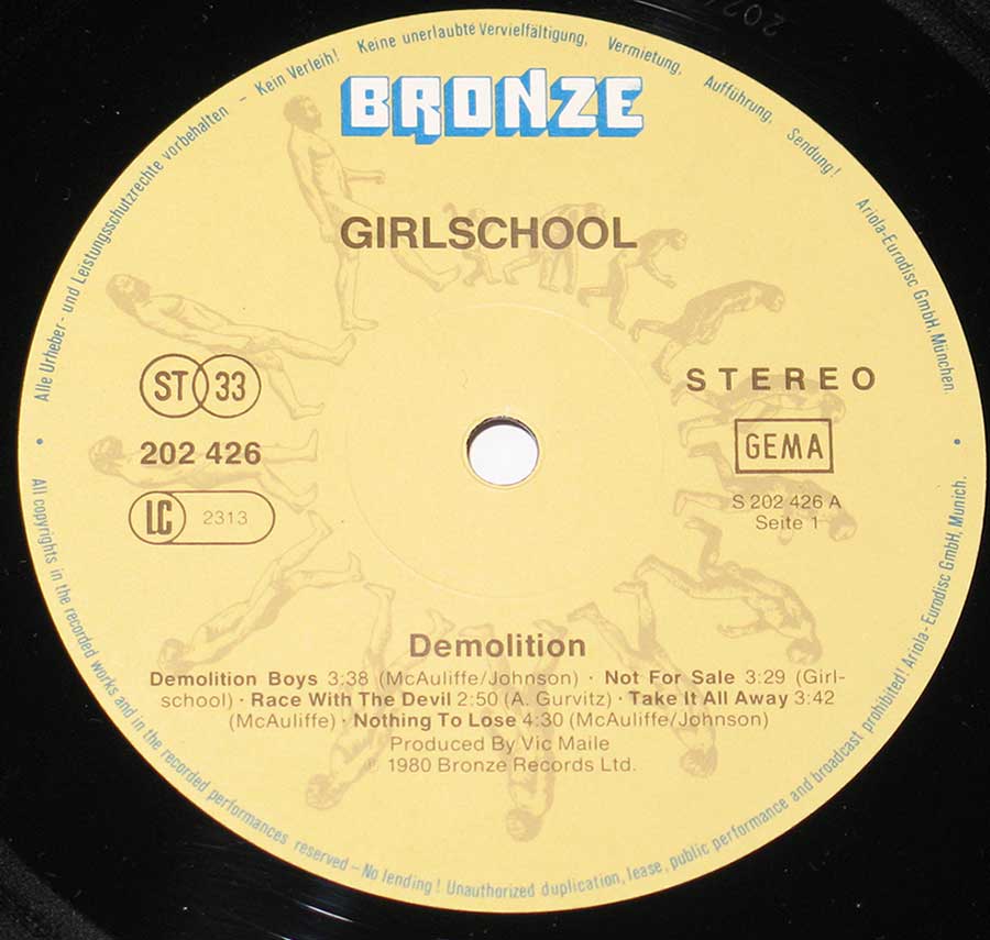
Girlschool's "Demolition" landed in 1980 with the manners of a brick through a plate-glass window: loud, impatient, British, and not terribly interested in asking permission from the boys leaning around the amps. This was Heavy Metal and NWOBHM with pub-floor grit still stuck to its boots, recorded before everything had to sound clinically enormous. The German Bronze pressing, catalogue number 202 426, keeps that same blunt charm: yellow Bronze label, GEMA box, ST 33 mark, and sleeve artwork that looks like a council demolition job got hijacked by a leather-jacket gang.

Open the hidden section and the fun gets better, because "Demolition" is not just “the debut by an all-female metal band”, that tidy little phrase people reach for when they have run out of thoughts. The record sits in the same 1980 weather system as Iron Maiden, Saxon, Angel Witch, Diamond Head, Def Leppard, and Motörhead, but it bites differently: less heroic posing, more back-alley shove. And yes, the sleeve and label details have a few small collector gremlins of their own, naturally.

Britain in 1980 was thick with new metal noise: cheap rehearsal rooms, paper-thin trousers, biker jackets, local support slots, and singles that looked as if they had been printed five minutes before the van left. Iron Maiden had the gallop, Saxon had the working-man engine, Angel Witch had the occult fog, Diamond Head had the strange elegance, Def Leppard were already eyeing bigger rooms, and Motörhead were Motörhead, which is less a comparison than a weather warning. Girlschool cut through that crowd not by sounding dainty, but by refusing to sand off the scrape.

The band had grown out of Painted Lady, with Kim McAuliffe and Enid Williams pushing the thing forward before Kelly Johnson and Denise Dufort helped turn it into Girlschool in 1978. That matters because "Demolition" does not sound like a label-invented answer to a trend. It sounds like a band that had already spent enough time in small rooms to know that volume is useful, but nerve is better.

Vic Maile produced the album, and thank heavens nobody dragged in some velvet-gloved studio genius to make it “proper”. Maile understood hard rock the useful way: keep the attack, leave some dirt, make the guitars speak clearly without polishing the teeth flat. Recorded at Jackson's Studio in England during April and May 1980, the record keeps a tight, dry pressure, the sort of sound that comes at you shoulder-first rather than floating in from the balcony.

"Demolition Boys" opens with that simple, grubby promise of trouble. Nothing fancy, no velvet curtain, just the band moving in with a crowbar. Kim McAuliffe's rhythm guitar gives the songs their blunt frame, Kelly Johnson's lead work cuts across it with a sharp metallic grin, Enid Williams pushes from underneath with bass and voice, and Denise Dufort keeps the drum kit moving like it has rent due. Girl talk? Fine. This is the sort where the lipstick is probably in the same pocket as a broken plectrum and a van key.

"Race With the Devil" is often where casual listeners start, and fair enough, because it is a short, sharp kick that grabs quickly. It is a version of The Gun's old song rather than some mysterious Girlschool original, and that distinction is worth keeping straight before the trivia police start polishing their little badges. The band does not treat it like a museum piece; they drive it harder, flatter, and more impatiently, which is exactly the point.

"Take It All Away" and "Emergency" are where the album shows its best trick: hooks without surrender. The songs move with punky nerve but carry proper metal weight, not the fake heavy stuff where everyone stands around admiring the size of the riff. There is tension in the way the vocals trade rough edges, and a pleasing lack of glamour in the whole thing. Nobody here sounds as if a stylist has just left the room. Good.

The old page text leans heavily on the “groundbreaking all-female powerhouse” angle, and yes, the gender fact matters because the rock world was hardly rolling out velvet ropes for women carrying guitars. But reducing Girlschool to novelty is lazy. The real correction is simpler: "Demolition" works because it is a tough early NWOBHM record with songs, bite, and a line-up that knew how to sound like a gang without turning into a slogan.

There was no grand release scandal around "Demolition", no church-burning panic, no moral-collapse newspaper carnival. The usual nonsense was more boring and more persistent: people treating the band as a curiosity first and musicians second. That kind of polite condescension is worse than outrage, really. At least outrage has a pulse.

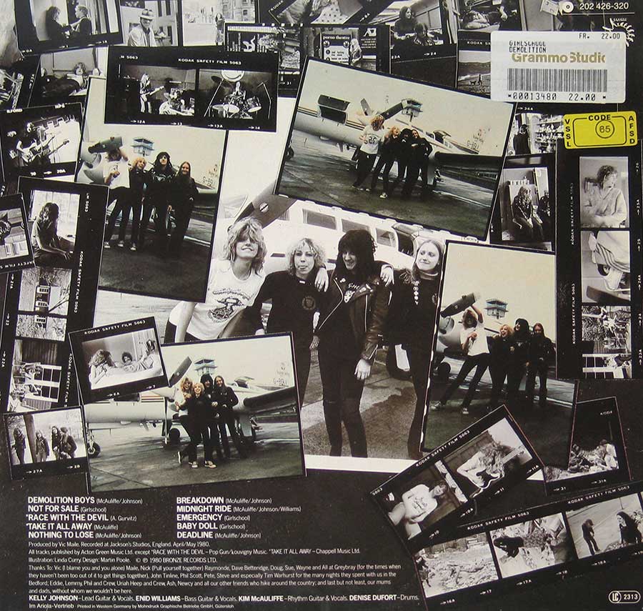
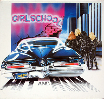
The German sleeve adds its own collector pleasure. The front cover is all wrecking ball, red helmet, steep city perspective, and yellow GIRLSCHOOL lettering, the sort of artwork that would make a minimalist designer reach for a damp cloth. The back cover is better still: contact sheets, band photos, airport shots, credits in small print, and on this copy a price sticker sitting there like a little survivor from somebody else's record-shop afternoon.

Late at night, this is not a headphone album for admiring microscopic production tricks. It is a record you play while the sleeve leans against the wall, the Bronze label catching the light, and the room feels a bit less tidy than before. That is not nostalgia doing all the work. Some records simply arrive with their elbows out.

On the label, the Side One timings differ slightly from the older page transcription: "Demolition Boys" appears as 3:38, "Not For Sale" as 3:29, "Race With The Devil" as 2:50, "Take It All Away" as 3:42, and "Nothing To Lose" as 4:30. Tiny pressing-and-print details like that are why collectors end up squinting at beige labels under bad light while pretending this is normal adult behaviour. It is not normal. It is better.

As a debut, "Demolition" does not have the grand architecture of later metal records, and it does not need it. It kicks, rattles, snaps, and occasionally sounds like it might overtake itself on a bend. That is the charm. In 1980, surrounded by faster, heavier, louder British records trying to muscle their way into the new decade, Girlschool made one that sounded lived-in from the first spin.

References

Album Key Details: Genre, Label, Format & Release Info

Music Genre:

NWOBHM New Wave of British Heavy Metal

Girlschool's "Demolition" sits right in the New Wave of British Heavy Metal blast zone: raw guitars, punk-fed speed, heavy metal attitude, and no patience for polite showroom polish. It has that early-1980s British bite, where the amps sound like they have been dragged across a pub floor and plugged in anyway.

Label & Catalognr:

BRONZE – Cat#: 202 426

Media Format:

Record Format: 12" LP Vinyl Stereo Gramophone Record
Total Weight: 230g

Release Details:

Release Date: 1980

Release Country: Germany

Production & Recording Information:

Producers:
  • Vic Maile – Producer, Sound Engineer

    Vic gave Motörhead and Girlschool enough shape to hit harder, not cleaner, which is exactly the point.

    Vic Maile — British producer and sound engineer, the sort of studio man I trust because he understood noise before trying to tidy it up. He began at Pye Studios in the mid-1960s, worked the mobile recording truck by the late 1960s, and had his fingerprints on rough, living rock rather than showroom polish. In the 1970s he engineered and produced for The Who, Dr. Feelgood, Eddie and the Hot Rods, The Pirates and other hard-working pub-rock bruisers. Then came the heavy-metal years: Motörhead's "Ace of Spades" in 1980 and "No Sleep 'til Hammersmith" in 1981, Girlschool's early Bronze-era punch in 1980-1981, and Twisted Sister's "Under the Blade" in 1982. He made bands sound awake, dangerous, and properly unwilling to behave.

Album Cover Design & Artwork:
  • Martin Poole – Design

    The layout man behind the sleeve’s controlled chaos, where wrecking-ball drama meets record-bin bait.

    Martin Poole, credited here for design, gives "Demolition" the visual shove it needs: big logo, slanted danger, and no polite white space for sensitive souls. His work frames Linda Curry’s wrecking-ball illustration so the sleeve hits fast from the racks, loud enough to match the album’s rough NWOBHM street-level punch.

  • Linda Curry – Artwork

    The artist who turned the title into comic-book destruction with a wink and a steel-toe boot.

    Linda Curry, credited for the album artwork, gives "Demolition" its glorious city-smashing front cover: red helmet, huge wrecking ball, warped buildings, and just enough cartoon menace to keep it from becoming dull macho rubble. Her illustration sells the album’s attitude before the needle drops, which is half the job done already.

Band Members / Musicians:

Band Line-up:
  • Kim McAuliffe – Rhythm guitar, vocals

    The rhythm-guitar anchor who keeps this demolition job from turning into loose rubble.

    Kim McAuliffe, Girlschool co-founder, rhythm guitarist, vocalist, songwriter, and one of the band’s stubborn driving forces, gives "Demolition" its clipped street-level shove. Her guitar work keeps the songs tight and unglamorous, while her vocals on selected tracks add that sharp, no-pampering edge; less sweet chorus girl, more boot heel on the monitor.

  • Kelly Johnson – lead guitar, vocals

    Girlschool’s razor-edged guitarist with a voice full of grit, smoke, and no patience for soft-focus nonsense.

    Kelly Johnson was the sharp-edged lead guitarist and voice who gave Girlschool its early bite. I hear her in those first records as the band’s live wire: joining the Painted Lady/Girlschool camp in 1978, she drove “Demolition” (1980), “Hit and Run” (1981), “Screaming Blue Murder” (1982) and “Play Dirty” (1983) with a tone that did not ask permission. She left in 1984, tried the Los Angeles route, wrote demos, and played with World’s Cutest Killers / The Renegades around 1987–1989. Back with Girlschool from 1993 to 1999, she gave the old engine one more proper roar before illness forced her off the road. No frills, no dainty nonsense — just steel, nerve, and a guitar line that cut through the smoke.

 
  • Enid Williams – Bass, vocals

    The bass engine and one of the voices that gives the record its back-room electricity.

    Enid Williams, co-founder of Painted Lady and Girlschool bassist-vocalist, sits right in the machinery of "Demolition". Her bass does not wander around looking clever; it pushes, grinds, and keeps the songs moving with pub-floor force. Her vocals add rough character too, the sound of a band doing the job instead of posing for the brochure.

  • Denise Dufort – Drums

    The drummer who gives the whole thing its chase, clatter, and useful lack of good manners.

    Denise Dufort, Girlschool’s drummer from the classic early line-up onward, gives "Demolition" its forward motion and its glorious sense of danger. Her playing is tight enough to hold the songs together, but never so tidy that the record loses its teeth; the drums kick, rattle, and shove like the van is late for the gig again.

Complete Track-listing:

Tracklisting Side One:
  1. Demolition Boys
  2. Not for Sale
  3. Race With the Devil
  4. Take It All Away
  5. Nothing to Lose
Tracklisting Side Two:
  1. Breakdown
  2. Midnight Ride
  3. Emergency
  4. Baby Doll
  5. Deadline

This "Demolition" copy has exactly the sort of sleeve work that makes an old metal collector slow down instead of just flipping past. The front cover is loud, comic-book rough, all yellow GIRLSCHOOL lettering, red helmet, grey city drop, and a wrecking ball that could flatten subtlety in one swing. The back is even more lived-in: black-and-white band shots, contact-strip clutter, small credits, track text, and that shop sticker still sitting there like a little price-tag fossil. Then the Bronze label calms the whole circus down with pale yellow ink, blue logo, GEMA box, ST 33 mark, and tiny catalogue details. Open the hidden gallery; that is where the label text and printing quirks start muttering.

Album Front Cover Photo
Front cover of Girlschool Demolition showing a  construction worker wearing a helmet worker-like character in a red hard hat, black jacket, yellow shirt, blue jeans, and boots climbing over a steep city street. A chain runs from the foreground hand to a large black wrecking ball on the right. Grey buildings tilt inward, small cars sit far below, the yellow GIRLSCHOOL logo is at the top, and the red Demolition title is at the lower right.

From above, this sleeve turns the whole city into a chute, the kind of steep comic-book canyon where buildings lean in too closely and the street below looks small enough to drop a cigarette onto. The first thing that grabs my eye is not the wrecking ball, oddly enough, but that red hard hat sitting under the yellow GIRLSCHOOL logo like a warning light. Then the chain pulls the eye downward, link by link, across the blue jeans and black jacket, until it lands on that fat black demolition ball smashing into the right-hand wall. Subtle? Not even close. But this is a 1980 NWOBHM sleeve, not a tasteful wine label, so fair enough.

Handling it in the photograph, the sleeve looks glossy in that slightly treacherous way old laminated covers do, where the airbrushed greys bloom under light and the darker blacks lose a little detail if the camera catches them badly. The lower-left corner shows a touch of softening and pale edge wear, and the border along the left side has that rubbed look collectors know too well: not damage enough to cry about, just enough to prove the thing has lived outside a plastic coffin. The bottom edge near the red Demolition title also feels visually compressed, like the artwork is trying to shove its way off the board.

The design concept is gloriously literal: Girlschool, demolition, wrecking ball, city in danger, job done, invoice in the post. Linda Curry’s artwork does not whisper; it waves a red helmet in your face and drags a chain through the street. Some of the anatomy and perspective are ridiculous, especially the crouched pose with one boot planted in mid-chaos, but that awkwardness is part of the charm. It feels drawn to be seen from across a record shop, not admired under gallery lighting by people saying things like “visual tension” while holding warm white wine. Thank God for small mercies.

The typography does most of its work by shouting in the right colours. GIRLSCHOOL sits at the top in thick yellow block letters with the winged face emblem tucked above, while the red album title slides across the lower-right corner like wet paint on a crash barrier. The greys of the buildings are scratchy and busy, almost too busy, but they make the helmet, hair, jeans, and title jump harder. A cleaner sleeve might have been more tasteful. It would also have been worse.

Album Back Cover Photo
Back cover of Girlschool Demolition showing a black-and-white collage of band photographs, contact-strip frames, airport and aircraft shots, and a larger central group portrait. Track titles and credits run along the lower left and center. A white Grammo Studio price sticker and yellow code sticker sit in the upper right, with the Bronze catalogue number printed nearby.

Seen from above on the desk, this back cover behaves like someone tipped a photographer’s contact sheets, tour snaps, and layout paste-ups into one black-and-white heap and then decided, yes, that’ll do. The eye lands first on the large central band portrait, because it has the cleanest breathing space, then gets dragged sideways into the smaller airport shots, the aircraft nose, the scattered film frames, and that stubborn upper-right shop sticker. The design idea is obvious and not especially polite: make the sleeve feel like a working band’s scrapbook, not a glossy corporate biography. Works better than it has any right to.

The surface has that slightly dull photographed-card look, with black ink gathering heavily around the contact-strip borders and the paler areas blooming where the flash or sleeve gloss has caught the camera. Along the top and side edges there is a faint rubbed softness, the sort of sleeve fatigue that comes from years of being pulled out, pushed back, and generally treated like a record rather than a museum baby. The white Grammo Studio sticker is the little nuisance that steals the corner: barcode, FR. 22.00, catalogue-like number, and a bit of visual clutter that would annoy a designer but delight a collector. Price stickers are vandals until they become history. Funny how that works.

The collage is busy, nearly too busy, and the bottom text suffers for it. Track titles, publishing notes, production credit, thanks list, band roles, Ariola-Vertrieb line, LC 2313 logo: all crammed into the lower strip like nobody wanted to pay for a lyric insert. The white type is readable but small, pressed into the black background with that familiar late-seventies/early-eighties impatience. The printed track list gives "Demolition Boys", "Not For Sale", "Race With The Devil", "Take It All Away", "Nothing To Lose", then the second-side titles opposite, so the sleeve is doing double duty as photo collage and information dump. Practical. Ugly in places. Useful, which usually wins.

What feels deliberate is the contact-sheet framing, especially the Kodak Safety Film markings and frame numbers running around the edges, giving the back cover a rough photographic rhythm. What feels accidental is better: the shop sticker covering part of the top-right area, the slight glare on the pale aircraft shots, the uneven density of the black borders, and the cramped credits fighting for survival at the bottom. This is not clean sleeve design. Good. Clean would have lied. This one looks handled, assembled, travelled, and filed away by someone who expected the music to do most of the talking.

Close up of Side One record’s label
Close-up of the Side One label for Girlschool Demolition on black vinyl. The pale yellow Bronze Records label has a blue BRONZE logo at the top, GIRLSCHOOL printed below, ST 33 and catalogue number 202 426 on the left, STEREO and GEMA on the right, S 202 426 A Seite 1 text, track titles near the bottom, and German rim text around the edge.

Seen from above, this Side One label is the sort of thing that makes a collector lean closer and forget the coffee going cold. The pale yellow Bronze label sits inside a black vinyl ring, with the blue BRONZE logo pushed high at the top and GIRLSCHOOL printed underneath in plain brown text. No drama there, just label-room practicality. Then the details start crowding in: ST 33 on the left, catalogue number 202 426 below it, LC 2313 tucked into its little box, STEREO and GEMA on the right, and "S 202 426 A Seite 1" sitting there like a small German bureaucrat checking the paperwork.

Handling the record mentally, the first physical thing that shows is the black vinyl edge around the label, not perfectly clean, with little dust flecks and light surface marks catching near the lower rim. The spindle hole is clean and central, surrounded by that faint circular pressure ring where labels always seem to reveal their manufacturing life if you bother looking. The yellow ink has a slightly warm, aged cast under the light, and the pale running-person ring graphic behind the text almost disappears unless the angle is kind. Nice idea, slightly too shy for its own good.

The track text at the bottom is where the useful irritation begins. "Demolition Boys" is printed as 3:38, "Not For Sale" as 3:29, "Race With The Devil" as 2:50, "Take It All Away" as 3:42, and "Nothing To Lose" as 4:30. That matters because older page notes and sleeve transcriptions can drift by a second or two, and suddenly a harmless label photo becomes evidence. Ridiculous hobby. Excellent hobby. The producer credit for Vic Maile sits just below the track block, followed by "1980 Bronze Records Ltd.", neat enough, though small enough to punish tired eyes.

The German rim text curves around the outer edge in blue-grey print, with the Ariola-Eurodisc GmbH, München reference running along the right side. It gives this pressing its regional fingerprints without needing a lecture. The design concept is simple: Bronze brand at the top, band and album in the middle, legal and format data orbiting the edge, tracks parked at the bottom. Functional, slightly cramped, and completely honest. Labels like this do not seduce. They testify. And sometimes, frankly, that is more useful than another overcooked sleeve painting.

All images on this site are photographed directly from the original vinyl LP covers and record labels in my collection. Earlier blank sleeves were not archived due to past storage limits, and Side Two labels are often omitted when they contain no collector-relevant details. Photo quality varies because the images were taken over several decades with different cameras. You may use these images for personal or non-commercial purposes if you include a link to this site; commercial use requires my permission. Text on covers and labels has been transcribed using a free online OCR service.

Collector’s Note: Girlschool - Demolition (1980) and the Great Floppy Disc Economy

When I picked up Girlschool - Demolition, released in 1980, my priorities were very simple: buy more NWOBHM and Heavy Metal LPs, then worry about sensible things later. Sensible things included extra floppy discs, decent storage space, and the sort of computer speed that did not make scanning album sleeves feel like waiting for concrete to dry.

Back then there was no friendly little cloud floating above my record shelves, politely swallowing every photo I threw at it. Storage was expensive, computers were slow, and every saved image felt like it had to justify its existence. So, yes, I photographed and archived what mattered most at the time: front covers, back covers, and labels. Blank inner sleeves? Usually sacrificed to the brutal economics of floppy-disc poverty. Very glamorous, this digital archaeology.

The joke, of course, is that the money went exactly where it should have gone: into records. If the choice was between another Bronze, Neat, or obscure Heavy Metal LP and a stack of floppy discs, the poor floppies never stood a chance. That is why some older photo galleries are incomplete today, not because I lacked collector enthusiasm, but because enthusiasm had already spent the budget in the record shop.

Index of GIRLSCHOOL Vinyl Album Discography and Album Cover Gallery

GIRLSCHOOL - Demolition album front cover vinyl LP album https://vinyl-records.nl

The 1980 Bronze debut that kicked the boys’ club in the shins

GIRLSCHOOL - Demolition

I keep coming back to "Demolition" because it still feels like a record made with one eye on the clock and the other on the next cheap pint. No velvet rope nonsense here. Girlschool shove the 1980 Bronze debut straight into the NWOBHM traffic: Kim McAuliffe snaps, Denise Dufort hammers, and "Demolition Boys" still sounds as if it might nick your hubcaps on the way out.

References
GIRLSCHOOL - Hit and Run album front cover vinyl LP album https://vinyl-records.nl

The 1981 Bronze getaway job with riffs, leather, and that glorious GRILLSCHOOL typo

GIRLSCHOOL - Hit and Run

"Hit and Run" is where I stop calling Girlschool promising and start moving furniture out of the way. This 1981 Bronze LP, German cat# 203 556, tears through "C'mon Let's Go", the title track, and a grubby little "Tush" with Vic Maile keeping the grease on the gears. The Buick sleeve shouts first, the back-cover GRILLSCHOOL typo shouts second. Lovely mess.

References
GIRLSCHOOL - Nightmare at Maple Cross album front cover vinyl LP album https://vinyl-records.nl

The 1986 GWR bruiser that drags Girlschool back toward the rough stuff

GIRLSCHOOL - Nightmare at Maple Cross

"Nightmare At Maple Cross" has that 1986 feeling of a band wiping off some studio gloss and reaching for the heavier tools again. This Dutch GWR Records RR 9671 LP, produced by Vic Maile, does not beg for approval. It stomps, scowls, and throws in a Mud cover like a grin after a bar-room argument. Not their tidiest moment, thank heavens. Tidy is overrated.

References
GIRLSCHOOL - Play Dirty album front cover vinyl LP album https://vinyl-records.nl

Girlschool go louder, shinier, and still refuse to behave

GIRLSCHOOL - Play Dirty

"Play Dirty" is the one I file under suspicious polish, but I never skip it. Girlschool let Noddy Holder and Jim Lea drag a bigger 1983 shine across the riffs, and this German Bronze 205 855 pressing wears it like a slightly too-bright jacket. The choruses punch harder, the edges look cleaner, yet there is still enough NWOBHM dirt under the nails to stop the thing becoming respectable.

References
GIRLSCHOOL - Screaming Blue Murder album front cover vinyl LP album https://vinyl-records.nl

The 1982 Bronze siren: sharp hooks, bad temper, no velvet gloves

GIRLSCHOOL - Screaming Blue Murder

"Screaming Blue Murder" is Girlschool with the screws tightened but not polished smooth, which is exactly how I want them. Nigel Gray gives the 1982 Bronze LP a crisp shove, and the new bass weight changes the engine room without wrecking the ride. "Don’t Call It Love" comes on like a pub jukebox with an attitude problem. Subtle? No. Thankfully, neither is a siren.

References